Service workers are awesome

In the war between native and web apps there's a few aspects that make a native app superior to a web app. Among these are features like push notifications and offline caching. A native app, once installed, is capable of providing the user with a cache of older content (possibly updated in the background) while it's fetching new, fresh content. This is a great way to avoid loading times for content and it's something that browser vendors tried to solve with cache manifests and AppCache. Everybody who has tried to implement offline caching for their webpages will know that the AppCache manifest files are a nightmare to maintain and that they're pretty mysterious about how and when they store things. And so the gap between native and web remained unchanged.

In comes the service worker

The service worker aims to solve all of our issues with this native vs. web gap. The service worker will allow us to have a very granular controlled cache, which is great. It will also allow us to send push notifications, receive background updates and at the end of this talk Jake Archibald mentions that the Chrome team is even working on providing stuff like geofencing through the service worker API. This leads me to think that the service worker just might become the glue between the browser and the native platform that we might need to close the gap once and for all.

If you watch the talk by Jake Archibald you'll see that the service worker can help a great deal with speeding up page loads. You'll be able to serve cached content to your users first and then add new content later on. You're able to control the caching of images that aren't even on your own servers. And more importantly, this method of caching is superior to browser caching because it will allow for true offline access and you can control the cache yourself. This means that the browser won't just delete your cached data whenever it feels the need to do so.

How the service worker works

When you want to use a service worker you have to install it first. You can do this by calling the register function on navigator.serviceWorker . This will attempt to install the service worker for your page. This is usually the moment where you'll want to cache some static assets. If this succeeds the service worker is installed. If this fails the service worker will attempt another install the next time the page is loaded, your page won't be messed up if the installation fails.

Once the service worker is installed you can tap into network requests and respond with cached resources before the browser goes to the network. For example, the browser wants to request /static/style.css . The service worker will be notified through the fetch event and you can either respond with a cached resource or allow the browser to go out and fetch the resource.

HTTPS only!!

Because the server worker is such a powerful API it will only be available through HTTPS when you use it in production. When you're on localhost HTTP will do but otherwise you are required to use HTTPS. This is to prevents man-in-the-middle attacks. Also, when you're developing locally you can't use the file:// protocol, you will have to set up a local webserver. If you're struggling with that, I wrote this post that illustrated three ways to quickly set up an HTTP server on your local machine. When you want to publish a demo you can use github pages, these are server over HTTPS by default so service workers will work there.

A basic server worker example

Browser support

Before I start with the example I want to mention that currently Chrome is the only browser that supports service workers. I believe Firefox is working hard to make an implementation happen as well and the other vendors are vague about supporting the service worker for now. This page has a good overview of how far the completion of service workers is.

The example

The best way to illustrate the powers of the service worker probably is to set up a quick demo. We're going to create a page that has ten pretty huge pictures on it, these pictures will be loaded from several resources because I just typed 'space' in to Google and picked a bunch of images there that I wanted to include on a webpage.

When I load this page without a service worker all the images will be fetched from the server, which can be pretty slow considering that we're using giant space images. Let's speeds things up. First create an app.js  file and include that in your page html right before the body tag closes. In that file you'll need the following script:

navigator.serviceWorker.register('worker.js')
    .then(function(){
        console.log("success!");
    },
    function(){
        console.log("failure..");
    });

This code snipper registers a service worker for our website. The register function returns a promise and when it gets resolved we just log the words 'success' for now. On error we'll log failure. Now let's set up the service worker.

// You will need this polyfill, at least on Chrome 41 and older.
importScripts('serviceworker-cache-polyfill.js');

var files_to_cache = [
    // an array of file locations we want to cache
];

this.addEventListener('install', function(evt){
    evt.waitUntil(
        caches.open("SPACE_CACHE")
            .then(function(cache){
                console.log("cache opened");
                return cache.addAll(files_to_cache);
            })
        );
    });

The code above creates a new service worker that adds a list of files to the "SPACE_CACHE" . The install eventHandler will wait for this operation to complete before it returns a success status, so if this fails the installation will fail as well.

Now let's write the fetch handler so we can respond with our freshly cached resources.

this.addEventListener('fetch', function(evt){
    evt.respondWith(
        caches.open("SPACE_CACHE").then(function(cache){
            return cache.match(evt.request).then(function (response) {
                return response || fetch(event.request.clone());
            });
        })
    );
});

This handler will take a request and match it against the SPACE_CACHE. When it finds a valid response, it will respond with it. Otherwise we will use the fetch API that is available in service workers to load the request and we respond with that. This example is pretty straightforward and probably a lot more simple than what you might use in the real world.

Debugging

Debugging service workers is far from ideal, but it's doable. In Chrome you can load chrome://serviceworker-internals/ or chrome://inspect/#service-workers to gain some insights on what is going on with your service workers. However, the Chrome team can still improve a lot when it comes to debugging service workers. When they fail to install properly because you're not using the cache polyfill for instance, the worker will return a successful installation after which the worker will be terminated without any error messages. This is very confusing and caused me quite a headache when I was first trying service workers.

Moving further with service workers

If you think service workers are interesting I suggest that you check out some examples and posts online. Jake Archibald wrote the <a href="http://jakearchibald.com/2014/offline-cookbook/" target="_blank">offline cookbook</a>. There's many information on service workers in there. You can also check out his <a href="https://github.com/jakearchibald/simple-serviceworker-tutorial" target="_blank">simple-serviceworker-tutorial</a> on Github, I learned a lot from that.

In the near future the Chrome team will be adding things like push notifications and geofencing to service workers so I think it's worth the effort to have a look at them right now because that will really put you in the lead when service workers hit the mainstream of developers and projects.

If you feel like I made some terrible mistakes in my overview of service workers or if you have something to tell me about them, please go ahead and hit me up on Twitter.

The source code for this blog post can be found on Github.

Some tips for new front-end developers

You've decided you want to get into front-end development and you've managed to learn a few things. The time has come for you to get some working experience and start growing your career in a beautiful field. I was in that position not so long ago and I noticed that actually having a job and working is a lot different than writing code from the safety of your own environment. So how do you present yourself in a professional way? How do you make sure that you learn as much as you can? Today I want to share some of the things I have learned about this.

Take yourself seriously

But don't be cocky. It's good to show to other people that you're serious about development. It will make sure that they don't just steamroll right over you. It will show that you have passion and aren't just there to put in a couple of hours and then go home aftwerwards. The things you say and do matter and it's okay to make sure that people know. However, at the same time you should be aware that you're just starting out. You're a junior developer and you're in the position to learn. Which brings me to my next point.

Ask questions

When you're trying to proof yourself it's easy to isolate yourself and work really hard. When your get assigned a task you're probably going to want to solve it on your own. It makes sense, you're trying to make a name for yourself and you're trying to be taken seriously. How will your colleagues be able to do that if you can't even be trusted with doing a small, simple task on your own? So you try to keep everything to yourself. Even though this mindset makes a lot of sense I want to advice you to ask questions. A lot of them. Don't just ask about the tasks you're trying to complete but also ask why certain things work the way they do. Ask what motivated a certain technology or design choice in your code base. Even ask you colleagues for their opinions on work related topics. You can learn a lot from them and it will prove to them that you care enough about your job to ask somebody for help with finding the best solutions.

Take responsibility for the code you work with

Now that you're part of a team of developers, you're sharing in the responsibility over a code base. When I was listening to Ben Orenstein's podcast a few days ago he mentioned something he noticed in interviews which really stuck with me. He said that when he asked people he interviewed why a certain piece of code worked the way it did many candidates would come up with a variety of excuses why they didn't know or care about how the code worked. What these excuses usually came down to was that somebody else wrote that piece of code and it wasn't 100% relevant to the task they were trying to do. So they would just assume that the person who wrote the code knew what they were doing and they didn't feel responsible for the code, so they wouldn't touch it.

When I thought about that I figured that I take code written by my colleagues for granted a lot of the time. Event though they often double check my code to see what it does and how it can be improved. They don't do that because they don't trust me, they do that because they feel responsible for the code I write because we all share a code base. So when you touch a piece of code somebody else wrote and you're not sure how it works you should ask somebody. If you do this it will show that you actually care about the bigger picture and that you're taking responsibility for the code that you're working with. And that is a good thing.

Don't pretend you know everything

When I was doing my first internship I though I actually knew a lot. Whenever my boss would come up with a project I would have a solution immediately. I think I kept that up for about a few months until I realized that in fact I didn't really know anything. I knew the very basics of Actionscript and I knew how to create simple things with Adobe Flash and that was it. I wasn't a good programmer, I just didn't know what I didn't know. So I want to advice you to be humble, be aware that you probably don't know half of what you think you know. You don't have the experience to know what works and what doesn't work. And nobody is going to blame you for that. It's okay to say that you're not sure about something, it's also okay to just say that you don't have a clue about how you should approach something. And again, it's okay to ask questions.

If anything, your colleagues and your boss will appreciate the fact that you ask them for help, it gives them a sense of comfort knowing that you're not just doing whatever. Many good developers also seem to enjoy the act of teaching, sharing their knowledge with others. So actually by not pretending you know it all you're learning more, making sure you don't do anything weird and you're providing others with the opportunity to share knowledge.

Take the time to read and learn

If you pick up a book on development every once in a while it will give you a much better understanding of the topic you're reading about. Even though the modern world allows you to find almost anything online I have found that books are a great way to take a more casual approach at learning. I feel like reading a book speaks to a whole different mindset for me and I seem to be able to focus a lot better and longer when I'm reading a book. Also, some subjects require the repetition and explanation that a book can give you.

This also applies to learning a new tool or framework. It's okay to sit down for an hour or two so you can read about it before you start working with it. I have found that doing this will provide a sense of context and it can really help with exploring the feature of the given framework. You'll also be able to gain a much deeper understanding of what goes on because sometimes the framework documentation will go in to why they made certain choices. While these choices may seem insignificant at first sight they might provide you with some context when you're actually working with the framework. Which can help you a lot in the long run.

Conclusions

When you're just starting out as a developer it's really easy to overlook all the things you don't know. When I was just starting out I worked with some people who kept emphasizing that some things were easy but I never knew why. I never asked. And if there's something I've noticed, it's that asking is key to becoming a better developer. And it doesn't stop there, you also have to listen. Listening is a great way to learn. Opinions of more experienced people aren't based on the latest and greatest, they're based on what works and what doesn't. They tend to have experience with a lot of things and also, they tend to admit when they aren't sure. So if somebody with tons of experience tells you something, assume that they know what they're talking about. And if you have doubts, ask them. They will most likely be happy to explain to you what they think and why. They will probably even be excited about hearing what you have to say as well. So I guess this whole post comes down to a few things. Be confident, be eager, ask questions and don't fake it.

Three simple ways to start a local webserver

When you first start out with web development you're probably opening html files right in your browser. You're probably using relative urls like /styles/style.css  and this is working fine for you. Right up until you're trying to load some files from a remote location and nothing really works anymore. You ask questions online and people tell you "oh just launch a local webserver and use it to access your files". Yeah, easier said that done, right? In this post I will explain three ways to quickly and simply start a local webserver. I'm going to assume you're either using OS X or a version of Linux for this tutorial.

Python

When you're using a Unix based system like Linux or OS X your machine should already have Python installed. Python comes with the ability to start a webserver for you, all you need to know is where your website files are and how to navigate to the in the command line.

Open up your command line and navigate to your website folder. For example: cd ~/Projects/my-website . Now that we are in the website's main folder we can launch the http server:

python -m SimpleHTTPServer

That's it, you should see some output in your terminal like:

Serving HTTP on 0.0.0.0 port 8000

You can now access your website on http://localhost:8000 and loading external files will work just fine. The server you just launched is a static file server so it will not serve up php files for example. It will just serve your html, css and javascript files.

Node.js and http-server

Another way to launch a local webserver is to use Node.js and the http-server package. This server will do the same as what the Python server does, it will serve your static files like html, css and javascript. Let's get this this running, shall we?

First, make sure that you have Node.js installed. If you don't have it installed, go to the Node.js website and follow the instructions there. When you have Node.js set up it's time to install http-server. Open up a terminal window and type:

npm install -g http-server

If this command throws an error at you, try to run it as sudo (sudo npm install -g http-server). When the installation is complete you can navigate to your website folder, for example type cd ~/Projects/my-website if that's where your website is located. To start the server you should type the following command:

http-server

That's all, you should see output like this:

Starting up http-server, serving ./ on: http://0.0.0.0:8080

Hit CTRL-C to stop the server

You now have a local server running at  http://localhost:8080.

Using a LAMP installer

Many webservers in the wild use the LAMP stack. LAMP is short for Linux, Apache, MySQL, PHP. Apache is a webserver, MySQL is a type of SQL database and PHP is a server-side language. If you're not comfortable with the command line or plan to do PHP development I recommend to install this stack on your development machine. A good installer for this is XAMPP. When you have XAMPP installed you get a graphical interface that you can use to start / stop your webserver and database server. XAMPP will also provide you with a folder that it uses to serve your files. So if you want to use this webserver for your project you will have to move that project in to the XAMPP web folder. Your webserver can be accessed through http://localhost .

Other ways

There are plenty of other ways to start webservers or run a local development environment. Especially if you're doing a lot more than just developing some html, css and javascript files. Personally I have used all three of these methods to launch webservers when I needed to quickly test something, so I figured I'd share these. Especially people who are struggling with loading external resources or want to approach the real word a little bit more in their experiments can benefit from these examples.

If you feel like I forgot a method or maybe I forgot to mention something important, send me a tweet.

Mobile-first is a great workflow

One of the first questions a client might ask you when you start talking about his new website site is "Will it be responsive?". And the answer to that question will more often than not be "Yes, it will". Especially now that Google will penalize websites that aren't mobile friendly it's important that you make sure that your site works well on mobile devices. How do you approach responsive webdesign in a good way? Even though I am not a designer I'd say mobile-first.

Different approaches to responsive web design

When you're doing a responsive webdesign there's a couple of ways to do it. Some people use Photoshop and design three different versions of their website, one for mobile phones, one for tablets and one for the desktop. Others just make one of these three and design the rest during development in the browser.

If you only design one of the three big options, which one should it be? And when you start to build the website, where do you start? Do you do the desktop version first since it's easier for you as a developer? Or do you start with the tablet version because it's in the middle of the spectrum? Or do you let the client decide and start with the one that makes them the happiest?

These are just a few of the options you have when you're doing responsive web design, there isn't a way that is forced upon you by anybody and you're free to choose whatever you feel is most efficient. But in practice there seems to be one approach in the development phase that works every time for me. That approach is mobile-first.

What is mobile-first?

Mobile-first means exactly what you probably think it means, it's when you start your process with the mobile phone. Ideally you will start both the design and the development phase by thinking about mobile straight away. My experience is, however, that clients prefer to see designs for how the website will look on a big screen with all the bells and whistles you might add. So designers tend to not really work from a mobile first perspective because they focus on what the client likes to see. This probably doesn't apply to every designer and every client but it does apply to most designers and clients I've worked with.

When you enter the development phase, the approach you take is in your hands, you can decide where to start. And deciding to start mobile first isn't just a matter of preference. There are very valid reasons to approach the development phase from a mobile-first perspective.

Why mobile-first?

When you are building a responsive website there's a lot of things to consider, how does this look on a screen that is X wide? Should module Y be visible on that screen? Thinking about everything for every screen is overwhelming, there's so much going on and you get so little for free when you're building a website. So you're going to have to start somewhere and I prefer that somewhere to be the smallest screen I will develop for.

Constraints

A mobile phone is not only the smallest, but also the most constraint and possibly even the most used device that people use to browse your website with. Obviously this doesn't apply to every website in the world but do not underestimate the amount of mobile browsing people do. Because of these factors it makes sense to first perfect the browsing experience on the small screens.

And since it's also the most constrained browsing experience you will have to focus on the parts of your app that really matter to your users. This will make sure that you don't just add a lot of noise because it might look cool or pretty.

Development speed

If you've made a responsive website before from a desktop first approach you probably noticed that you had to 'undo' a lot of your styling and scripting. I'd like to illustrate this with a little bit of code. The code will take an unsorted list and turn it into a nice navigation bar for the desktop view. On mobile the list will be shown as a list.

.nav-list {
    list-style: none;
    margin: 0;
}

.nav-list li {
    padding: 0;
    display: inline-block;
}

@media (max-width: 600px) {
    .nav-list li {
        display: list-item;
    }
}

Do you notice how we first set .nav-list li  to a non-default value, inline-block  and then on screens smaller than 600 pixels we set .nav-list li  back to it's default value. Let's rewrite this from a mobile-first perspective.

.nav-list {
    list-style: none;
    margin: 0;
}

.nav-list li {
    padding: 0;
}

@media (min-width: 600px) {
    .nav-list li {
        display: inline-block;
    }
}

This is a small example so the difference isn't dramatic but the implications are significant. Instead of adding and removing styles we are simply adding more styles when the screen is at least 600 pixels wide. By taking this approach it's much more clear what's going on and it's also harder to make mistakes.

With the navigation list example in mind, imagine that we want to add a border and some padding to the list items, but only for the desktop view. Let's compare both approaches again, shall we?

desktop first

.nav-list {
    list-style: none;
    margin: 0;
}

.nav-list li {
    padding: 1em;
    border: 1px solid #333;
    border-radius: .5em;
    display: inline-block;
}

@media (max-width: 600px) {
    .nav-list li {
        display: list-item;
        padding: 0;
        border: none;
        border-radius: 0;
    }
}

mobile first

.nav-list {
    list-style: none;
    margin: 0;
}

.nav-list li {
    padding: 0;
}

@media (min-width: 600px) {
    .nav-list li {
        display: inline-block;
        padding: 1em;
        border: 1px solid #333;
        border-radius: .5em;
    }
}

As you can see the mobile first approach is a lot cleaner. Not only is it cleaner, it's also safer. We don't have to worry about resetting certain styles back to their defaults like we have to in our desktop-first approach.

Of course you still have to keep an eye out for cascading accidents because sometimes you set something for mobile that will have to be reset for your desktop view. But in my experience this happens a lot less often with mobile-first than it does with desktop-first.

Adding javascript is easier than removing it

I just showed you that when it comes to css it's a lot easier to stack on more styles than it is to reset them to defaults for mobile. The same applies for javascript. I usually find myself initializing a lot less (complex) modules for mobile. When you take a mobile-first approach with this you will not initialize certain things at first. Once you know that you're on a large screen machine you can start initializing your larger, more complex modules that are intended for desktop use.

Not only is it easier to initialize things when you know you need them, it's also a lot faster. Imagine executing some heavy javascript on a mobile phone only to find out that the module won't even be used because the target elements are hidden. That's a waste of precious resources that you might have used to get your page up and running on the device really quick.

Conclusion

In this post I explained to you what a mobile-first approach is from the perspective of a developer. I also showed you how this impacts the process of writing code. Going in mobile-first will prevent you from having to write a lot of 'reset this to default' css. It's also easier for the javascript part of your application. You won't initialize thing that you don't need and this generally makes your pages render faster as well.

I'm not saying that a desktop-first approach is worst in every case or scenario, I'm also not saying that the design process has to be mobile first. But thinking about the smallest most constrained devices does seem to result in faster and more focused websites. It also seems to lead to a more solid code base and happier developers.

You should start using Browsersync today.

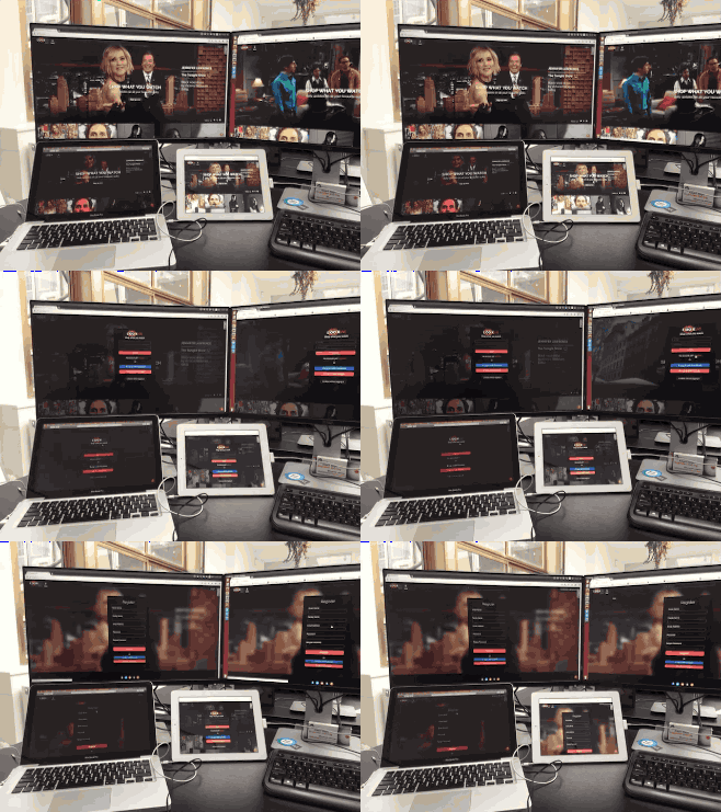
Seriously, you should. Browsersync is a great tool that allows you to sync your browser on multiple screens. This might not sound that impressive, but in reality it is. It's so impressive that I felt like I needed to make a .gif for you because you otherwise might not get how awesome Browsersync is.

bs_demo

The above image shows four different browsers, all of them are acting in sync. I am only interacting with the browser on the top right, the other three are automatically updating through Browsersync.

Why should you use it?

Personally, I held off trying Browsersync for quite some time. But when I installed it last Friday I was absolutely amazed, it was so easy and it's such a great tool to test multiple browsers. Even mobile browsers play nice with Browsersync. Integrating it with gulp was extremely simple as well so I can refresh all connected browsers whenever my css or javascript gets compiled. Need more than reloading and syncing? Well, there's more to Browsersync than those two features.

Remote debugging

When you're working on a Linux machine, like I am, and somebody walks up to you with their iPhone and show you a bug it can be a real pain in the arse. Debugging Safari on an iPhone without having a Mac nearby is damn near impossible. With Browsersync it's as easy as connecting the iPhone to Browsersync and you can remotely inspect the DOM, console and more. Isn't that awesome? If that's not cool I don't know what is.

Setting this up for yourself

Let's set up Browsersync for whatever project you're working on right now, shall we? First install Browsersync through npm:

npm install browser-sync --save-dev

Make sure you have gulp installed as well, if you've never used gulp before then you might want to check out my post on getting started with gulp.

In your gulpfile make sure to include Browsersync.

var browserSync = require('browser-sync');

Let's say we want to start Browsersync whenever we start our gulp watch task. And then whenever our css changes we want to refresh the browser. Doing this is actually incredibly simple. Here's the code:

gulp.task('watch', function(){
    browserSync({
        proxy: 'http://localhost:5000'
    });

    gulp.watch({glob: 'scss/**/*.scss'}, ['css', browserSync.reload]);
});

The above code is creating a watch task on line one. Then on line 3-5 we start Browsersync. The only option I'm passing to it is a proxy. In this example I assume you have a current development setup where you're running your app server in a way you're used to. The project I tried Browsersync with is a Python app, so using a proxy is the best way for my own use case. You can also opt for running Browsersync on a folder, it's up to you really. Check out the docs for more options.

When the css changes we start the css task. The next task we pass is the browserSync.reload function. When this function is called all connected browsers will reload. And that's all, you're using Browsersync.

When you start your watch task by typing gulp watch , Browsersync will tell you the url for your project in the console. It also tells you a UI url. This url is where you'll find some great features and debugging options. You should try to explore them a little, they're really nice.

Moving forward

Now that you have Browsersync set up you can start exploring it's great features. The documentation for Browsersync is really good and goes in depth about all the options you can pass to it. The debugger is really powerful and deserves to be used once you start checking everything out. Hopefully you'll enjoy using Browsersync and the way it can speeds up your development workflow.

If you think I've missed anything, if you have questions or feedback, you can find me on Twitter.