Creating a custom UICollectionViewLayout in Swift
Note:
This blog post has been updated for Xcode 11 and Swift 5 👍🏼
If you’re looking to learn more about the new collection view layout techniques that were introduced in iOS 13, this post should contain everything you need.
If you've ever built an iOS app that uses some kind of grid layout or displays a list in a way that doesn't fit a UITableView you have probably used a UICollectionView. This component allows for very simple grid layout creation and it even allows you to dynamically change layouts with beautiful animations. UICollectionView becomes even more powerful and flexible if you create your own layout by subclassing UICollectionViewLayout.
Recently I had to build a kind of playful, almost grid-like layout. To me, this seemed like the best time to dive straight into subclassing UICollectionViewLayout and create a nice layout. In this post, I will explain how I did it and I'll provide you with a little bit of code so you can start building your own layouts in no-time.
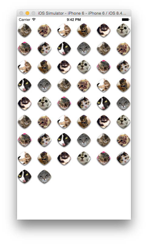
The end result
Since I'm a great fan of cats, we'll be building a collection of cat images. The images will be rounded, they'll have a nice shadow so they look kind of nice and the magic bit is, of course, the slightly offset rows that are provided by the custom UICollectionViewLayout.
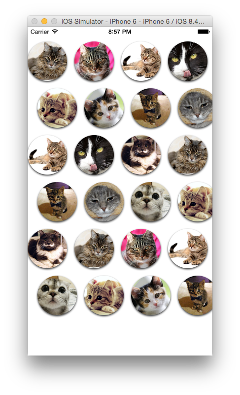
The image above illustrates what we'll end up with when we're done. It's quite something, isn't it?
Creating your custom layout
Before we get to build our layout we have to do some set up. Create a new Xcode project and use the Single View Application template. I named my project "CustomCollectionViewLayout" because I'm not very good at coming up with clever names. You can name your project anything you like. Make sure that you pick Storyboard for the layout, we won't be using SwiftUI in this post.
Step one: setting up the interface
Creating the UICollectionView
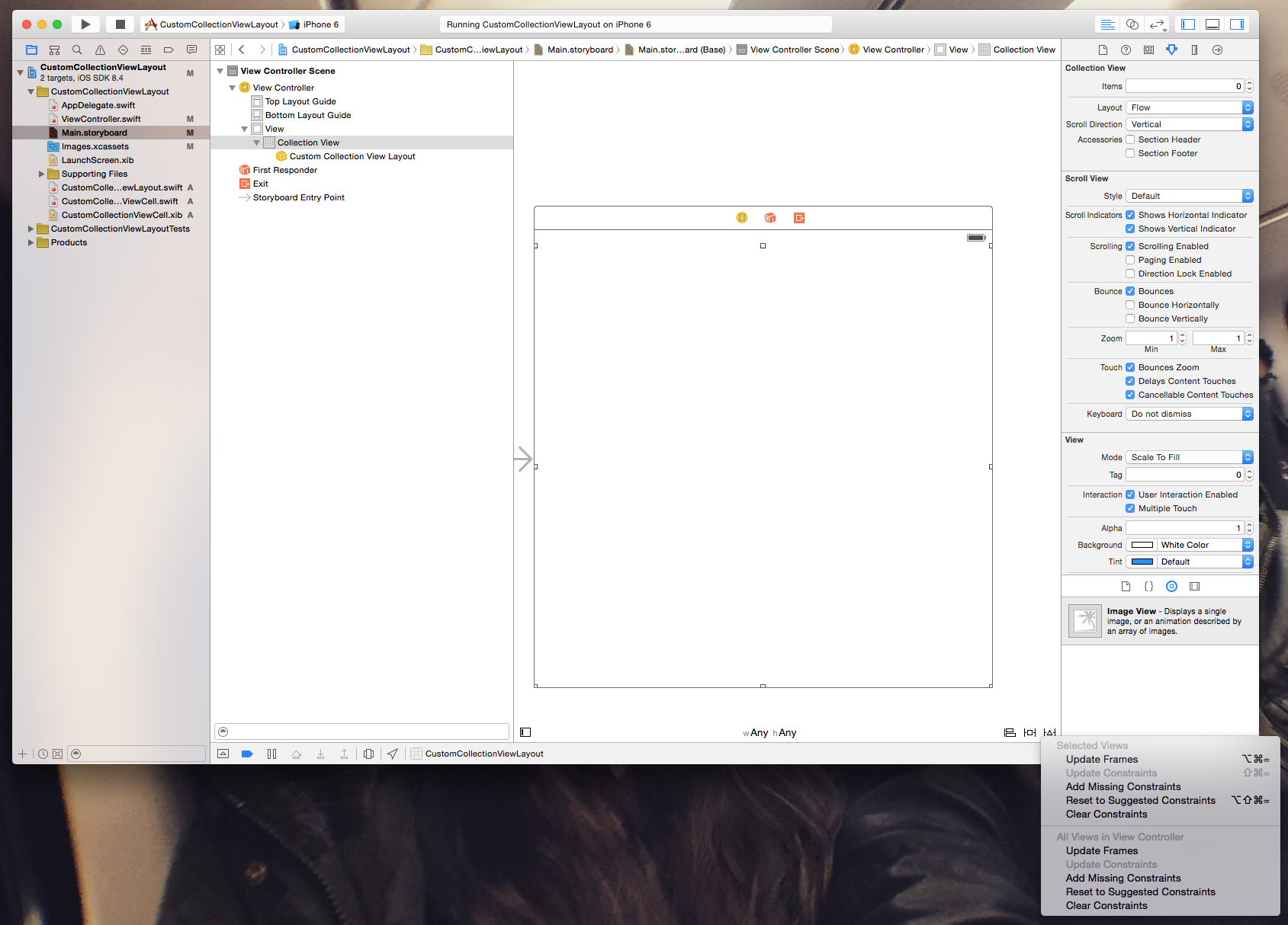
The first thing you should do is open up the Main.storyboard and drag a UICollectionView out to your View Controller. When you've done this give the collection view a white background color and add constraints to it so it will fit your view nicely. If you're unsure how to do this, size the collection view so that it touches the left, bottom and right edges of the view and it should be aligned underneath the status bar. XCode should provide you with some helpful guides for this. Once your view is sized like this, click in the bottom right corner of your canvas and choose Reset to suggested constraints.
Next, we should connect the collection view to our ViewController class. Open up the assistant editor by pressing the two overlapping circles in your XCode window and make sure that the editor is set automatically use an appropriate file.
Select the UICollectionView, hold ctrl and drag over to the code editor to create an outlet for the UICollectionView. I named mine "collectionView". That's all the setup we need for now.
Creating a UICollectionViewCell
To display our cat images we need to have a UICollectionViewCell with an image inside of it. To do this we can simply create our own UICollectionViewCell and put a UIImageView inside of it.
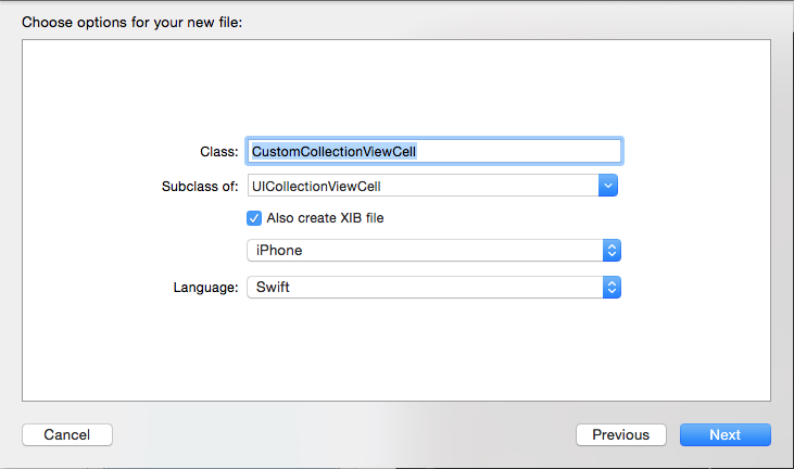
First, create a new CocoaTouch Class (either press cmd+n or by navigating through the file menu). Name your file CustomCollectionViewCell, make it subclass UICollectionViewCell and check "Also create xib file".
XCode should have created a .swift and .xib file for you. Let's open up the .xib file first and then press the assistant editor button so we have both the .xib and .swift file open at the same time. Drag a UIImageView out into your custom cell and size it so that it fills up the cell exactly. Since we'll be resizing the cell later we should "Reset to suggested constraints" again, just like we did with the UICollectionView earlier. Now select the image, press and hold ctrl and then drag to your swift file to create an outlet for the imageView. I named mine "imageView".
Our example image had rounded corners and a shadow applied so let's write some code to make this happen. All you need is a few lines inside awakeFromNib().
override func awakeFromNib() {
  imageView.layer.cornerRadius = 40
  imageView.clipsToBounds = true

  layer.shadowColor = UIColor.black.cgColor
  layer.shadowOffset = CGSize(width: 0, height: 2)
  layer.shadowRadius = 2
  layer.shadowOpacity = 0.8
}
This code is fairly straightforward. First, we apply rounded corners to our imageView. Then we apply a shadow to the cell itself. You can tweak the numbers to change how the cell looks. Did you notice the magic number 40? In an actual app, you might want to find a better solution for this because 40 is half of the cell's eventual size but there's no way to know that unless you came up with all the sizings yourself.
The last thing we have to do is register this custom cell to our UICollectionView. We created an IBOutlet for the UICollectionView earlier by ctrl+dragging from the UICollectionView to the ViewController. Open up ViewController.swift and add this line to the viewDidLoad method:
collectionView.register(UINib(nibName: "CustomCollectionViewCell", bundle: nil), forCellWithReuseIdentifier:cellIdentifier)
We're using a cellIdentifier variable here, let's define that as well. Place this code right below your collectionView outlet:
private let cellIdentifier = "collectionCell"
Allright, that's all. Our UI is fully prepared now. The code you've added to ViewController.swift should look like this:
@IBOutlet weak var collectionView: UICollectionView!

private let cellIdentifier = "collectionCell"

override func viewDidLoad() {
    super.viewDidLoad()

    collectionView.register(UINib(nibName: "CustomCollectionViewCell", bundle: nil), forCellWithReuseIdentifier:cellIdentifier)
}
Step two: setting up the UICollectionView dataSource
To get our UICollectionView to display our collection of cat pictures we will need to make sure our UICollectionView knows where to go for its data. To do this, select the connections inspector in the right drawer of XCode and drag the dataSource connector to the ViewController class.
To actually implement the dataSource we should make our ViewController comply to the UICollectionViewDataSource protocol. Open up ViewController.swift and change it's class definition to this:
class ViewController: UIViewController, UICollectionViewDataSource
By adding UICollectionViewDataSource after the superclass we tell Swift that this class implements the UICollectionViewDataSource protocol. This protocol dictates that we should at least provide our UICollectionView with:
- the amount of sections it should contain
- the amount of items there are in each sections
- cells to display
The following code takes care of all this:
func numberOfSectionsInCollectionView(collectionView: UICollectionView) -> Int {
  return 1
}

func collectionView(_ collectionView: UICollectionView, numberOfItemsInSection section: Int) -> Int {
  return 50
}

func collectionView(_ collectionView: UICollectionView, cellForItemAt indexPath: IndexPath) -> UICollectionViewCell {
  let cell = collectionView.dequeueReusableCell(withReuseIdentifier: cellIdentifier, for: indexPath) as! CustomCollectionViewCell

  cell.imageView.image = UIImage(named: "cat_\(indexPath.row%10)")

  return cell
}
The collection view will contain a single section with 50 items. Our cell creation code is also fairly straightforward, we dequeue the cell that we've registered before and we forcefully cast it to be a CustomCollectionViewCell. Then we set the imageView.image to one of the cat images you've added to the project earlier. I only added 10 images so I reuse them. To use the next code snippet in your own project, you should add 10 images to your Images.xcassets and name them cat_0.jpg - cat_9.jpg.
If we were to run our app now we'd end up with something like this:
Not quite what we wanted.. but don't worry, we're going to implement our custom layout right now!
Step three: implementing the custom layout
Now that we're all set up it's time to get to hard part; the custom layout! First, create a now Cocoa Touch Class and call it "CustomCollectionViewLayout". It should subclass UICollectionViewFlowLayout. To avoid many small chunks of code I've grouped together some code in sensible groups, I'll show you code first and then explain what it does right after that. Here's the first chunk:
let itemWidth: CGFloat = 80
let itemSpacing: CGFloat = 15
var layoutInfo = [IndexPath: UICollectionViewLayoutAttributes]()
var maxXPos: CGFloat = 0

override init() {
  super.init()
  setup()
}

required init?(coder aDecoder: NSCoder) {
  super.init(coder: aDecoder)
  setup()
}

func setup() {
  // setting up some inherited values
  self.itemSize = CGSize(width: itemWidth, height: itemWidth)
  self.minimumInteritemSpacing = itemSpacing
  self.minimumLineSpacing = itemSpacing
  self.scrollDirection = .horizontal
}
This first section is responsible for the initial setup. It sets up some sizing values (remember that magic number 40 in our cell?) and it creates an array that we'll use to store our layout in. When you're creating a collection view that changes often or contains a lot of items you might not want to use this technique but since we have a relatively small collection that doesn't change often we can cache our entire layout. There's also a variable to hold the maxXPos , we'll use that to calculate the collectionView's content size later. In the setup() function we configure the layout, these properties are inherited from the UICollectionViewFlowLayout and allow us to set up spacings and a scrollDirection. In this case we're not really using the spacings but I think it's good practice to set them up anyway.
override func prepare() {
  layoutInfo = [IndexPath: UICollectionViewLayoutAttributes]()
  for i in (0..<(self.collectionView?.numberOfItems(inSection: 0) ?? 0)) {
    let indexPath = IndexPath(row: i, section: 0)
    let itemAttributes = UICollectionViewLayoutAttributes(forCellWith: indexPath)
    itemAttributes.frame = frameForItemAtIndexPath(indexPath)
    if itemAttributes.frame.origin.x > maxXPos {
      maxXPos = itemAttributes.frame.origin.x
    }
    layoutInfo[indexPath] = itemAttributes
  }
}

func frameForItemAtIndexPath(_ indexPath: IndexPath) -> CGRect {
  let maxHeight = self.collectionView!.frame.height - 20
  let numRows = floor((maxHeight+self.minimumLineSpacing)/(itemWidth+self.minimumLineSpacing))

  let currentColumn = floor(CGFloat(indexPath.row)/numRows)
  let currentRow = CGFloat(indexPath.row).truncatingRemainder(dividingBy: numRows)

  let xPos = currentRow.truncatingRemainder(dividingBy: 2) == 0 ? currentColumn*(itemWidth+self.minimumInteritemSpacing) : currentColumn*(itemWidth+self.minimumInteritemSpacing)+itemWidth*0.25
  let yPos = currentRow*(itemWidth+self.minimumLineSpacing)+10

  return CGRect(x: xPos, y: yPos, width: itemWidth, height: itemWidth)
}
This piece of code comes after our initial setup, it overrides the prepareLayout function which is called before the cells are actually going to need their layout. This allows us to pre-calculate our entire layout. Which is exactly what we want to do for this use case. There's a loop inside this function that uses the collectionView.numberOfItemsInSection function to find out how many items it is going to display. It then initializes layoutAttributes for the item at the current NSIndexPath and it calls frameForItemAtIndexPath. To calculate the item's frame. Next up is a check to determine of the x position for this item is the largest x position in our collection and then it stores the itemAttributes in our layout cache.
The frameForItemAtIndexPath function uses the height of our collectionView to determine the amount of cells it can fit into a single column, then it determines how many rows there will be in our collection and based on that it calculates the x and y position for the item. Every other item will be offset somewhat to the right, we use the % operator and a ternary for that. If currentRow % 2 == 0 the xPos is equal to currentColumn(itemWidth+self.minimumInteritemSpacing), otherwise it will be equal to currentColumn(itemWidth+self.minimumInteritemSpacing)+itemWidth*0.25. And finally we return a CGRect with the correct size and position values.
This last snippet of code actually provides our collection with the layout:
override func layoutAttributesForItem(at indexPath: IndexPath) -> UICollectionViewLayoutAttributes? {
  return layoutInfo[indexPath]
}

override func layoutAttributesForElements(in rect: CGRect) -> [UICollectionViewLayoutAttributes]? {
  var allAttributes: [UICollectionViewLayoutAttributes] = [UICollectionViewLayoutAttributes]()

  for (_, attributes) in layoutInfo {
    if rect.intersects(attributes.frame) {
      allAttributes.append(attributes)
    }
  }

  return allAttributes
}

override var collectionViewContentSize: CGSize {
  let collectionViewHeight = self.collectionView!.frame.height
  let contentWidth: CGFloat = maxXPos + itemWidth

  return CGSize(width: contentWidth, height: collectionViewHeight)
}
The first method, layoutAttributesForItemAtIndexPath simply returns the layout attributes that belong to the passed IndexPath. Fairly straightforward. Next, we have layoutAttributesForElementsInRect. This method is somewhat more complex because we get passed a CGRect and we have to determine which items are inside of that area. To do this we loop over our layoutInfo object, we compare the rects and we return all intersecting items.
Finally, we calculate the collectionView's contentSize. The contentWidth is equal to our maxXPos + itemWidth and the height is the same as the collectionView's height.
Step four: using the custom layout
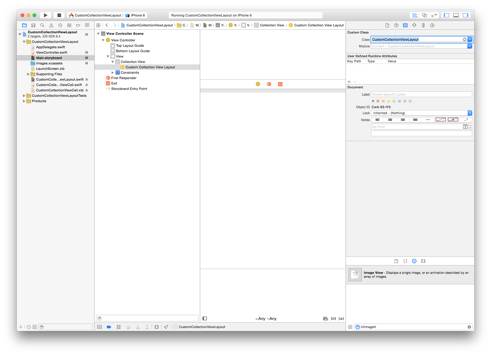
The final step in this tutorial is to actually make the UICollectionView use our custom layout. To make this happen, select the Collection View Flow Layout object that is associated with your UICollectionView in your Main.storyboard and change it's class to CustomCollectionViewLayout.
Now build and run your app, you should see something like the image I showed you at the beginning of this post.

In conclusion
I hope this post is helpful to some of you out there. I had a lot of fun today figuring out how to do this myself and I figured there's probably more people out there who are looking for cool ways to implement UICollectionView and use custom layouts.
If you want to learn more about collection view layouts, check out my post called Using compositional collection view layouts in iOS 13.
The code for this project can be found on GitHub and if you want to reach out to me, I'm on Twitter.