Icon fonts vs. svg icons
We can all agree that using png sprites for icons is not the most modern (or best) way to present icons on the web. Png is a rasterized format which means that if you try to make the image (or icon) larger, the quality will become worse. When browsers started properly supporting @font-face and svg some people chose to use icon fonts to serve their icons, others chose svg sprites to do this. These methods share the big benefit of scalability. This matters because our websites get viewed on many devices and you want your icons to be crisp on every device, not just the ones you optimized for by hand. This post is intended to give an overview of these two methods and to explore the benefits and drawbacks of each method. At the end of this post you will hopefully have an understanding of both svg icons and iconfonts and you'll be able to choose one of these icon delivery methods for your own projects.
TL;DR: The comparison is very close, both have their big upsides and no real big downsides. I'd say iconfonts win because they're a bit easier to use. Svg icons are a easier to position and manipulate. The code for this blogpost is on Github.
Getting set up
The first thing I'm going to compare is the set up process for each method. The method you end up choosing should not only work well but it should also be easy to manage. The first method I will set up is the iconfont. I will be using Gulp to automate the asset creation process. I made this decision because I use Gulp on all my projects. Also, Gulp seems like the right tool for this type of job; I don't want to create my assets by hand. The icons I'm going to use were created by Jamison Wieser for The Noun Project.
Icon font
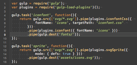
Like I mentioned, I will be using Gulp to generate my assets. The gulp-iconfont plugin seems like a good plugin to generate a font with. I also used the gulp-iconfont-css plugin so I didn't have to create my own css template. With a couple of lines in my gulpfile and two plugins I managed to convert my svg icons into a font. Not bad!
svg icons
To make using the icons easy I will create a spritesheet that contains all my svg icons. I'll be using gulp for this as well, just like I did for the iconfont. I've set up my output in "defs" mode. Which means that I can use the icons like Chris Coyier descrives in this css-tricks.com post. This method only uses one gulp plugin but the fact that this gulp plugin uses svg-sprite which has a ton of options, it does seem a little less straightforward to set up. The output that was produced seems decent on first viewing so that's good.
Easiest to set up
Both methods are actually easy to set up within about 5-10 minutes. Therefor, this section will be a tie. Both methods are easy to set up and there isn't a clear winner.
Filesize
Something we should always take into consideration is the file size of the things we end up using. So, a simple comparison in filesize:
iconfont: 8kb (or 12kb if the svg font is used)
spritesheet: 25kb
Best filesize
The winner in this example is the iconfont. The iconfont is significantly less Kb than the spritesheet is.
Ease of use
Whenever I pick a technique I want to use, it has to be something that's easy to use. Of course it's important that something works well, is fast and lightweight and more but I feel like ease of use should be mentioned right alongside those requirements because in the end you might end up working with the tool or technique you chose for quite some time. So for my own sanity, I like something that's easy to use.
Implementing
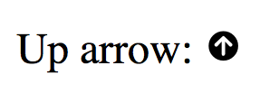
To implement the iconfont all you have to do is add the stylesheet to the head of your document. In order to use the icons you just create span elements and give them the icon class. The second class you give them is your icon's name. An example:
Up arrow: <span class="icon icon-arrow_top"></span>
Easy enough, right? This results in the following rendered output:
To implement the svg spritesheet I needed a polyfill to make everything work. That's because IE doesn't support the <use> method for external svgs and I didn't want to include the whole svg inside of my html body. For more info refer to this css-tricks.com post. The html I ended up using looks like this:
Up arrow: <svg viewBox="5.0 -11.0 100.0 135.0" class="icon"><use xlink:href="assets/icons.svg/defs/svg/sprite.defs.svg#arrow_top"></use></svg>
This is quite a bit more complicated than the iconfont method. I had to figure out the proper viewBox settings for my icon and I have to do a lot more typing.
Positioning
When you want to position your icon with the iconfont method you'll run into some weird and complicated stuff eventually. That's because the iconfont is rendered as text so for example, there's line-height applied to it. This could lead to unpredictable and strange behavior in some cases.
When you use the spritesheet approach you get to decide almost everything. The sizing, positioning, display style, you can all directly manipulate it as if you're manipulating an image. So for positioning, the spritesheet is definitely better.
Styling
When you want to style your icons you're going to love the spritesheet approach. because you're working with actual svg icons you can set strokes, fill colors and everything. Just like you might do with any other svg! The iconfont however is flattened in a way. You can set a color for the whole icon bt you can't style individual sections, so the spritesheet is more customizable than the iconfont is.
The easiest to use method
Even though it's a little bit more work to implement, the spritesheet wins. It's easier to position and the more powerful styling options are also a big advantage over an iconfont. So the winner for this section is spritesheet, hands down.
Render quality
Personally I haven't seen the difference yet but there are definitely some potential rendering differences between the spritesheet and an iconfont. Because an iconfont is rendered by the browser as a font, it is also anti aliased. The result of this could be that your icons look less sharp if they're used as a font. Like I said, I haven't had any issues with this in the real world but the potential is there.
The best rendering method
Even though the rendering seems to be nearly identical the spritesheet wins here. That's because an iconfont can potentially suffer from a lack of sharpness due to anti aliasing of the browser.
Browser support
The @font-face method of embedding custom fonts is supported by all major browsers so it's very safe to use. The spritesheet method is supported by all browsers except for IE. However, a polyfill called svg4everybody is available so at the end of the day both methods are available on all major browsers.
The best browser support
Because the spritesheet method requires a polyfill and the iconfont doesn't I declare the iconfont the winner of the browser support section.
And the winner is..
After exploring and comparing both the iconfont and spritesheet approach I can honestly say that the comparison is very close. The iconfont is better at the implementation, more lightweight and it has better browser support. The spritesheet is more flexible, easier to work with and has great browser support if you include a polyfill.
Earlier in the article I mentioned that one of the major factors for me to decide on things like this is ease of use. And because of that I would say that the iconfont wins. The decision is really tough actually because I'm not a fan of how you have to mess around in order to position an icon with this technique. Nor am I a fan of the anti aliasing risks because I like my icons to be sharp and crisp. But iconfonts are lightweight, easy to use and implement in general and I've never come across a situation where I actually had to style parts of an icon rather than change the color of the entire icon. So, yeah, that concludes this post. Iconfonts win. If you beg to differ or have feedback for me, please send me a Tweet. I'd love to your opinions on this.
If you want to have a look at the source files I've used, the repo is on located right here on Github.