Icon fonts vs. svg icons

We can all agree that using png sprites for icons is not the most modern (or best) way to present icons on the web. Png is a rasterized format which means that if you try to make the image (or icon) larger, the quality will become worse. When browsers started properly supporting @font-face and svg some people chose to use icon fonts to serve their icons, others chose svg sprites to do this. These methods share the big benefit of scalability. This matters because our websites get viewed on many devices and you want your icons to be crisp on every device, not just the ones you optimized for by hand. This post is intended to give an overview of these two methods and to explore the benefits and drawbacks of each method. At the end of this post you will hopefully have an understanding of both svg icons and iconfonts and you'll be able to choose one of these icon delivery methods for your own projects.

TL;DR: The comparison is very close, both have their big upsides and no real big downsides. I'd say iconfonts win because they're a bit easier to use. Svg icons are a easier to position and manipulate. The code for this blogpost is on Github.

Getting set up

gulpfile

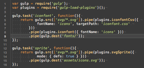
The first thing I'm going to compare is the set up process for each method. The method you end up choosing should not only work well but it should also be easy to manage. The first method I will set up is the iconfont. I will be using Gulp to automate the asset creation process. I made this decision because I use Gulp on all my projects. Also, Gulp seems like the right tool for this type of job; I don't want to create my assets by hand. The icons I'm going to use were created by Jamison Wieser for The Noun Project.

Icon font

Like I mentioned, I will be using Gulp to generate my assets. The gulp-iconfont plugin seems like a good plugin to generate a font with. I also used the gulp-iconfont-css plugin so I didn't have to create my own css template. With a couple of lines in my gulpfile and two plugins I managed to convert my svg icons into a font. Not bad!

svg icons

To make using the icons easy I will create a spritesheet that contains all my svg icons. I'll be using gulp for this as well, just like I did for the iconfont. I've set up my output in "defs" mode. Which means that I can use the icons like Chris Coyier descrives in this css-tricks.com post. This method only uses one gulp plugin but the fact that this gulp plugin uses svg-sprite which has a ton of options, it does seem a little less straightforward to set up. The output that was produced seems decent on first viewing so that's good.

Easiest to set up

Both methods are actually easy to set up within about 5-10 minutes. Therefor, this section will be a tie. Both methods are easy to set up and there isn't a clear winner.

Filesize

Something we should always take into consideration is the file size of the things we end up using. So, a simple comparison in filesize:

iconfont: 8kb (or 12kb if the svg font is used)
spritesheet: 25kb

Best filesize

The winner in this example is the iconfont. The iconfont is significantly less Kb than the spritesheet is.

Ease of use

Whenever I pick a technique I want to use, it has to be something that's easy to use. Of course it's important that something works well, is fast and lightweight and more but I feel like ease of use should be mentioned right alongside those requirements because in the end you might end up working with the tool or technique you chose for quite some time. So for my own sanity, I like something that's easy to use.

Implementing

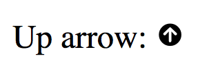
To implement the iconfont all you have to do is add the stylesheet to the head  of your document. In order to use the icons you just create span  elements and give them the icon class. The second class you give them is your icon's name. An example:

Up arrow: <span class="icon icon-arrow_top"></span>

Easy enough, right? This results in the following rendered output:

Schermafbeelding 2015-04-16 om 19.51.31


To implement the svg spritesheet I needed a polyfill to make everything work. That's because IE doesn't support the <use> method for external svgs and I didn't want to include the whole svg inside of my html body. For more info refer to this css-tricks.com post. The html I ended up using looks like this:

Up arrow: <svg viewBox="5.0 -11.0  100.0 135.0" class="icon"><use xlink:href="assets/icons.svg/defs/svg/sprite.defs.svg#arrow_top"></use></svg>

This is quite a bit more complicated than the iconfont method. I had to figure out the proper viewBox settings for my icon and I have to do a lot more typing.

Positioning

When you want to position your icon with the iconfont method you'll run into some weird and complicated stuff eventually. That's because the iconfont is rendered as text so for example, there's line-height applied to it. This could lead to unpredictable and strange behavior in some cases.

When you use the spritesheet approach you get to decide almost everything. The sizing, positioning, display style, you can all directly manipulate it as if you're manipulating an image. So for positioning, the spritesheet is definitely better.

Styling

When you want to style your icons you're going to love the spritesheet approach. because you're working with actual svg icons you can set strokes, fill colors and everything. Just like you might do with any other svg! The iconfont however is flattened in a way. You can set a color for the whole icon bt you can't style individual sections, so the spritesheet is more customizable than the iconfont is.

The easiest to use method

Even though it's a little bit more work to implement, the spritesheet wins. It's easier to position and the more powerful styling options are also a big advantage over an iconfont. So the winner for this section is spritesheet, hands down.

Render quality

Personally I haven't seen the difference yet but there are definitely some potential rendering differences between the spritesheet and an iconfont. Because an iconfont is rendered by the browser as a font, it is also anti aliased. The result of this could be that your icons look less sharp if they're used as a font. Like I said, I haven't had any issues with this in the real world but the potential is there.

The best rendering method

Even though the rendering seems to be nearly identical the spritesheet wins here. That's because an iconfont can potentially suffer from a lack of sharpness due to anti aliasing of the browser.

Browser support

The @font-face method of embedding custom fonts is supported by all major browsers so it's very safe to use. The spritesheet method is supported by all browsers except for IE. However, a polyfill called svg4everybody is available so at the end of the day both methods are available on all major browsers.

The best browser support

Because the spritesheet method requires a polyfill and the iconfont doesn't I declare the iconfont the winner of the browser support section.

And the winner is..

After exploring and comparing both the iconfont and spritesheet approach I can honestly say that the comparison is very close. The iconfont is better at the implementation, more lightweight and it has better browser support. The spritesheet is more flexible, easier to work with and has great browser support if you include a polyfill.

Earlier in the article I mentioned that one of the major factors for me to decide on things like this is ease of use. And because of that I would say that the iconfont wins. The decision is really tough actually because I'm not a fan of how you have to mess around in order to position an icon with this technique. Nor am I a fan of the anti aliasing risks because I like my icons to be sharp and crisp. But iconfonts are lightweight, easy to use and implement in general and I've never come across a situation where I actually had to style parts of an icon rather than change the color of the entire icon. So, yeah, that concludes this post. Iconfonts win. If you beg to differ or have feedback for me, please send me a Tweet. I'd love to your opinions on this.

If you want to have a look at the source files I've used, the repo is on located right here on Github.

Automagically load your Gulp plugins

When I first started using gulp I felt that the most annoying thing about it all was that I had to manually require  all my plugins. So on a large project I would get 20 lines of requiring plugins. Soon I was looking for a solution that would allow me to include plugins automatically and thankfully I found one that's extremely easy to use. It's called gulp-load-plugins.

Using gulp-load-plugins

In order to use gulp-load-plugins you must first install it through npm. Open up a terminal window and type npm install --save-dev gulp-load-plugins if it fails due to permission errors you might have to run the command as sudo . When the plugins is installed you can use it inside your gulpfile like this:

var gulp = require('gulp');
var plugins = require('gulp-load-plugins')();

gulp.task('scripts', function() {
    gulp.src("/scripts/src/*.js")
        .pipe(plugins.plumber())
        .pipe(plugins.concat('app.js'))
        .pipe(plugins.uglify())
        .pipe(gulp.dest("/scripts/"))
});

On line 2 gulp-load-plugins is being included. Note that we immediately call  this module as well by adding parentheses after requiring it. When you call the plugin it looks through your node_modules  and it adds every module that starts with gulp- to itself as a callable function. So if you have gulp-uglify installed you can just call plugins.uglify .

When you have a gulp plugin that has a name with dashes in it, like gulp-minify-css . The loader will add it as minifyCss . In other words it will camelcase the plugin names. Well, that's it. This gulp plugin really helped my gulp workflow and I hope it will help you as well.

Stop writing vendor prefixes, autoprefixer does that for you

Anybody who writes css for the modern web has probably touched vendor prefixes at some point in time. These prefixes are required to get the most out of browsers that are supporting bleeding edge properties in ways that aren't yet part of the css3 spec. When you’re writing these vendor prefixes it’s easy to forget one or two, or maybe you add one that isn't actually required for the browsers that you’re supporting. Of course you can always check out caniuse.com to check the prefixes you need for your use case but that’s something you don’t want to do on a daily basis.

And even if you knew all the prefixes you probably wouldn't know the syntax for each property. For example, take flexbox. Flexbox uses several implementations across several browsers and writing a full stack of vendor prefixes for it would look a little bit like this:

.flexbox {
    display: -webkit-box;
    display: -webkit-flex; /* two webkit versions!?!?!? */
    display: -ms-flexbox;
    display: flex; 
}
 
.flexbox .flexitem {
    -webkit-flex-shrink: 0;
    -ms-flex-negative: 0;
    flex-shrink: 0; 
}

Using autoprofixer you can just write this and it will output the above prefixes for you:

.flexbox {
    display: flex;
}
 
.flexbox .flexitem {
    flex-shrink: 0;
}

Much better, right?

How does it work?

Autoprefixer uses caniuse.com to figure out what prefixes it should use. When you use autoprefixer you can always define what browser you want to support. You can define the browsers in a very natural way, for example you could pass it > 5%  which tells it to only support browsers that have more than 5% share in the market.

It then scans your entire css for properties that require prefixes and it automatically adds them to your css. Simple enough, right?

Setting this up for yourself

I will use Gulp to set up autoprefixer. If you’re unfamiliar with Gulp, I’ve written a post on getting started with it. I recommend you read that before you continue. If you’ve used Gulp before, grab your gulpfile and open a terminal window.

First of all we should install the gulp-autoprefixer plugin. Do this by typing npm install —save-dev gulp-autoprefixer . If you get permission errors you might have to run this command as sudo (sudo npm install —save-dev gulp-autoprefixer). Now that we have that set up we can add gulp-autoprefixer to our css task like this:

var gulp = require(‘gulp’);
var sass = require(‘gulp-sass’);
var autoprefixer = require(‘gulp-autoprefixer’);
 
gulp.task('css', function(){
    gulp.src('src/sass/**/*.scss')
        .pipe(sass())
        // the important lines
        .pipe(autoprefixer({
            browsers: '> 5%'
        })) 
        .pipe(gulp.dest('contents/css/'));
});

If you already use gulp only lines 9-11 will be important to you. What’s going on here is just a regular css compile task. We take all our .scss files and stream them to the sass plugin so they will be compiled. After doing that we stream the compiled css to the autoprefixer which will add all the vendor prefixes we need. Then the output gets saved and you’re done, you can write prefix-free css now!

A note about the above code

After publishing this I received a note from Andrey Sitnik, the author of Autoprefixer, saying that gulp-postcss should be used over gulp-autoprefixer. Below is an example of using autoprefixer with gulp-postcss. To use this you should first install both packages: npm install --save-dev gulp-postcss autoprefixer-core .

Example code:

var gulp = require(‘gulp’);
var sass = require(‘gulp-sass’);
var autoprefixer = require('autoprefixer-core'
var postcss = require(‘gulp-postcss’);
 
gulp.task('css', function(){
    gulp.src('src/sass/**/*.scss')
        .pipe(sass())
        // the important lines
        .pipe(postcss([
            autoprefixer({
                browsers: '> 5%'
            })
        ])) 
        .pipe(gulp.dest('contents/css/'));
});

The nice thing about using postcss is that you can combine multiple postprocessors. That makes it more powerful that just using gulp-autoprefixer.

How about Bourbon?

Bourbon is a sass mixing library that has many features, one of which is prefixing css. It does this by providing mixins to you that will prefix the css you pass it. An example:

a {
    @include transition(color, 200ms);
 
    &:hover {
        color: blue;
    }
}

When you compile your sass this will output properly prefixed css. The big plus for this is that you have one plugin less in your gulp file because sass (with some help of bourbon) is now prefixing your css. However, you still have to remember what properties use prefixes. That in itself isn’t bad, it’s good to know what you’re working with but it’s also easy to forget to use the mixin and end up with forgotten prefixes.

Wrapping up

In this post I've explained to you, briefly, why you shouldn't be writing your own vendor prefixes. It's easy to forget some and they're high maintenance. I also explained to you that a gulp plugin called gulp-autoprefixer can make your live a lot easier by automagically prefixing css rules that require a vendor prefix.

I also showed you really quick that you can use Bourbon to achieve effectively the same thing but it's a little bit more high maintenance than using autoprefixer.

The main point is, you don't have to write prefixes yourself. There are two very nice tools out there and each has it's own pro's and con's. I personally prefer autoprefixer because it uses caniuse.com to figure out what it should prefix and I can have 0 worries about remembering what properties need prefixing.

You should start using Browsersync today.

Seriously, you should. Browsersync is a great tool that allows you to sync your browser on multiple screens. This might not sound that impressive, but in reality it is. It's so impressive that I felt like I needed to make a .gif for you because you otherwise might not get how awesome Browsersync is.

bs_demo

The above image shows four different browsers, all of them are acting in sync. I am only interacting with the browser on the top right, the other three are automatically updating through Browsersync.

Why should you use it?

Personally, I held off trying Browsersync for quite some time. But when I installed it last Friday I was absolutely amazed, it was so easy and it's such a great tool to test multiple browsers. Even mobile browsers play nice with Browsersync. Integrating it with gulp was extremely simple as well so I can refresh all connected browsers whenever my css or javascript gets compiled. Need more than reloading and syncing? Well, there's more to Browsersync than those two features.

Remote debugging

When you're working on a Linux machine, like I am, and somebody walks up to you with their iPhone and show you a bug it can be a real pain in the arse. Debugging Safari on an iPhone without having a Mac nearby is damn near impossible. With Browsersync it's as easy as connecting the iPhone to Browsersync and you can remotely inspect the DOM, console and more. Isn't that awesome? If that's not cool I don't know what is.

Setting this up for yourself

Let's set up Browsersync for whatever project you're working on right now, shall we? First install Browsersync through npm:

npm install browser-sync --save-dev

Make sure you have gulp installed as well, if you've never used gulp before then you might want to check out my post on getting started with gulp.

In your gulpfile make sure to include Browsersync.

var browserSync = require('browser-sync');

Let's say we want to start Browsersync whenever we start our gulp watch task. And then whenever our css changes we want to refresh the browser. Doing this is actually incredibly simple. Here's the code:

gulp.task('watch', function(){
    browserSync({
        proxy: 'http://localhost:5000'
    });

    gulp.watch({glob: 'scss/**/*.scss'}, ['css', browserSync.reload]);
});

The above code is creating a watch task on line one. Then on line 3-5 we start Browsersync. The only option I'm passing to it is a proxy. In this example I assume you have a current development setup where you're running your app server in a way you're used to. The project I tried Browsersync with is a Python app, so using a proxy is the best way for my own use case. You can also opt for running Browsersync on a folder, it's up to you really. Check out the docs for more options.

When the css changes we start the css task. The next task we pass is the browserSync.reload function. When this function is called all connected browsers will reload. And that's all, you're using Browsersync.

When you start your watch task by typing gulp watch , Browsersync will tell you the url for your project in the console. It also tells you a UI url. This url is where you'll find some great features and debugging options. You should try to explore them a little, they're really nice.

Moving forward

Now that you have Browsersync set up you can start exploring it's great features. The documentation for Browsersync is really good and goes in depth about all the options you can pass to it. The debugger is really powerful and deserves to be used once you start checking everything out. Hopefully you'll enjoy using Browsersync and the way it can speeds up your development workflow.

If you think I've missed anything, if you have questions or feedback, you can find me on Twitter.

How to prevent Gulp from crashing all the time

When you're working with Sass and use Gulp to compile your  .scss files it can happen that you introduce an error by accident. You misspell one of your mixins or variables and gulp-sass will throw an error. When this happens your Gulp task crashes and you have to restart it. When I started using Gulp this drove me crazy and I really wanted a solution for this problem.

Gulp-plumber

The solution I found is called gulp-plumber. This nifty plugin catches stream errors from other plugins and allows you to handle them with a custom handler. You can also let gulp-plumber handle the errors, it outputs them to your console by default. So when a plugin encounters an error you will be notified of the error and you can easily fix it without having to restart your Gulp task.

Example code

gulp.task('scss', function(){
    gulp.src('/**/*.scss')
        .pipe(plumber())
        .pipe(sass())
        .pipe(gulp.dest('/css/'));
});

The above example takes all scss files as input and then 'activates' gulp-plumber. After doing this you can use gulp like you are used to. Whenever an error occurs after activating plumber it will be caught and handled so gulp doesn't crash on you. That's it, hopefully this is helpful to you. If you have questions about this quick tutorial you can find me on Twitter.

Getting started with Gulp

Let's talk about tools first

Lately I've noticed that many Front-end developers get caught up in tools. Should they use Less, or Sass? Do they code in Sublime or Atom? Or should they pick up Coda 2? What frameworks should they learn? Is Angular worth their time? Or maybe they should go all out on Ember or Backbone.

And then any developer will reach that point where they want to actually compile their css, concatenate their javascript and minify them all. So then there is the question, what do I use for that? Well, there's many options for that as well! Some prefer Grunt, others pick Gulp and some others turn to Codekit for this. Personally I got started with Codekit and swapped that out for Gulp later on. The reason I chose Gulp over Grunt? I liked the syntax better and people said it was exponentially faster than Grunt.

What is Gulp

After dropping all these tools in the previous paragraphs you might be confused. This article will focus on getting you started with Gulp. But what is Gulp exactly?

Gulp is a task runner, it's purpose is to perform repetitive tasks for you. When you are developing a website some things you might want to automate are:

  • Compiling css
  • Concatenate javascript files into a single file
  • Refresh your browser
  • Minify your css and javascript files

This would be a very basic setup. Some more advanced task include:

  • Running jshint
  • Generating an icon font
  • Using a cachebuster
  • Generating spritesheets

And many, many more. The way Gulp does all these things is through plugins. This makes Gulp a very small and lightweight utility that can be expanded with plugins so it does whatever you want. At this time there's about 1200 plugins available for gulp.

When should I learn Gulp

You should learn Gulp whenever you feel like you are ready for it. When you're starting out as a front-end developer you will have to learn so many things at once I don't think there's much use in immediately jumping in to use Sass, Gulp and all the other great tools that are available. If you feel like you want to learn Sass (or Less) as soon as you start learning css you don't have to learn Gulp as well. You could manually compile your css files as you go. Or you could use a graphical tool like Codekit for the time being. Like I said, there's no need to rush in and confuse yourself.

What about Grunt?

For those who payed attention, I mentioned Grunt at the start of this article. I don't use Grunt for a very simple reason, I don't like the syntax. And also, Gulp is supposed to be faster so that's nice. I feel like it's important to mention this because if you choose to use a tool like Gulp or Grunt you have to feel comfortable. A tool should help you get your job done better; using a tool shouldn't be a goal in itself.

That said, Grunt fulfills the same purpose as Gulp, which is running automated tasks. The way they do it is completely different though. Grunt uses a configuration file for it's tasks and then it runs all of the tasks in sequence. So it might take a Sass file and turn it into compiled css. After that it takes a css file and minifies it. Gulp uses javascript and streams. This means that you would take a Sass file and Gulp turns it into a so called stream. This stream then gets passed on an plugins modify it. You could compare this with an assembly line, you have some input, it get's modified n times and then at the end you get the output. In Gulp's case the output is a compiled and minified css file. Now, let's dive in and create our first gulpfile.js!

Creating a gulpfile

The gulpfile is your main file for running and using gulp. Let's create your first Gulp task!

Installing gulp

I'm going to assume you've already installed node and npm on your machine. If not go to the node.js website and follow the instructions over there. When you're done you can come back here to follow along.

To use gulp you need to install it on your machine globally and locally. Let's do the global install first:

npm install -g gulp

If this doesn't work at once you might have to use the sudo prefix to execute this command.

When this is done, you have successfully installed Gulp on your machine! Now let's do something with it.

Setting up a project

In this example we are going to use gulp for compiling sass to css. Create the following folders/files:

my_first_gulp/
    sass/
        style.scss
    css/
    gulpfile.js

In your style.scss files you could write the following contents:

$background-color: #b4da55

body {
    background-color: $background-color;
}

Allright, we have our setup complete. Let's set up Gulp for our project.

Setting up Gulp

Let's start by locally installing gulp for our project:

npm install gulp

If you're more familiar with npm and the package.json file that you can add to your project you'll want to run the command with --save-dev appended to it. That will add gulp as a dependency for your project. This also applies to any plugins you install.

Next up, we install the sass compiler:

npm install gulp-sass

We're all set to actually build our gulpfile now. Add the following code in there:

var gulp = require('gulp');
var sass = require('gulp-sass');

gulp.task('css', function(){
    gulp.src('sass/style.scss')
        .pipe(sass())
        .pipe(gulp.dest('css/'));
});

gulp.task('watch', function(){
    gulp.watch('sass/**/*.scss', ['css']);
});

In this file we import gulp and the gulp sass module. Then we define a task, we call the task css. Inside of this task we take our style.scss file and pipe it through to the sass plugin. What happens here is that the sass plugin modifies the stream that was created when we loaded sass/style.scss. When the sass plugin is done it sends the stream on to the next pipe call. This time we call gulp.dest to save the output of our stream to the css folder.

Think of this process as an assembly line for your files. You put the raw file in on one end, apply some plugins to it in order to build your final file and then at the end you save your output to a file.

The second task we define is called watch. This is the task we're going to start from the command line in a bit. What happens in this task is that we tell gulp to watch everything we have in our sass folder, as long as it ends in .scss. When something changes, Gulp will start the css task.

Go back to your command line and type:

gulp watch

Now go to your style.scss file, change something and save it (or just save it). You should see something happening in the command line now.

[20:54:17] Starting 'css'...
[20:54:17] Finished 'css' after 3.63 ms

That's the output I get. If you check the css folder, there should be a css file in there. You just generated that file! That's all there is to it.

Moving forward

Now that you've learned to compile sass files into css files with gulp you can start doing more advanced things. Gulps powerful syntax shouldn't make it too hard to expand on this example. Usually you just add an extra pipe to your file, call the plugin you want, repeat that a few times and then eventually you save the output file.

I hope this guide to getting started with gulp is helpful to you. If you have notes for me, questions or just want to chat you can send me a tweet @donnywals