What is Approachable Concurrency in Xcode 26?
Xcode 26 allows developers to opt-in to several of Swift 6.2’s features that will make concurrency more approachable to developers through a compiler setting called “Approachable Concurrency” or SWIFT_APPROACHABLE_CONCURRENCY. In this post, we’ll take a look at how to enable approachable concurrency, and which compiler settings are affected by it.
How to enable approachable concurrency in Xcode?
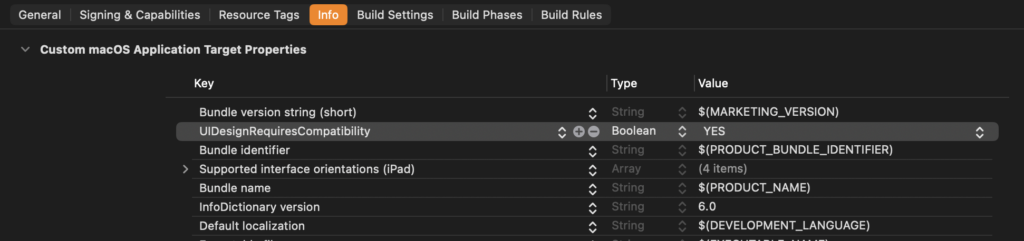
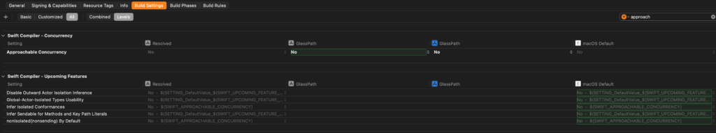
To enable approachable concurrency, you should go to your project’s build settings and perform a search for “approachable concurrency” or just the word “approachable”. This will filter all available settings and should show you the setting you’re interested in:
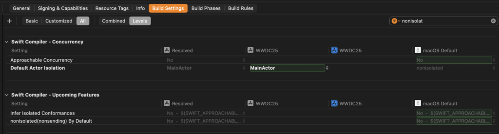
By default, this setting will be set to No which means that you’re not using Approachable Concurrency by default as of Xcode 26 Beta 2. This might change in a future release and this post will be updated if that happens.
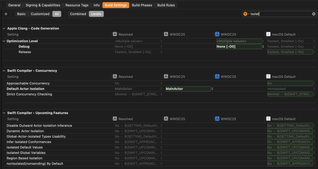
The exact settings that you see enabled under Swift Compiler - Upcoming Features will be different depending on your Swift Language Version. If you’re using the Swift 6 Language Version, you will see everything except the following two settings set to Yes:
- Infer isolated conformances
nonisolated(nonsending)By Default
If you’re using the Swift 5 Language Version like I am in my sample project, you will see everything set to No.
To turn on approachable concurrency, set the value to Yes for your target:
This will automatically opt you in to all features shown above. Let’s take a look at all five settings to see what they do, and why they’re important to making concurrency more approachable.
Which settings are part of approachable concurrency?
Approachable concurrency mostly means that Swift Concurrency will be more predictable in terms of compiler errors and warnings. In lots of cases Swift Concurrency had strange and hard to understand behaviors that resulted in compiler errors that weren’t strictly needed.
For example, if your code could have a data race the compiler would complain even when it could prove that no data race would occur when the code would be executed.
With approachable concurrency, we opt-in to a range of features that make this easier to reason about. Let’s take a closer look at these features starting with nonisolated(nonsending) by default.
Understanding nonisolated(nonsending) By Default
The compiler setting for nonisolated(nonsending) is probably the most important. With nonisolated(nonsending) your nonisolated async will run on the calling actor’s executor by default. It used to be the case that a nonisolated async function would always run on the global executor. Now that behavior will change and be consistent with nonisolated functions that are not async.
The @concurrent declaration is also part of this feature. You can study this declaration more in-depth in my post on @concurrent.
Understanding Infer Sendable for Methods and Key Path Literals
This compiler flag introduces a less obvious, but still useful improvement to how Swift handles functions and key paths. It allows functions of types that are Sendable to automatically be considered Sendable themselves without forcing developers to jump through hoops.
Similarly, in some cases where you’d leverage KeyPath in Swift, the compiler would complain about key paths capturing non-Sendable state even when there’s no real potential for a data race in certain cases.
This feature is already part of Swift 6 and is enabled in Approachable Concurrency in the Swift 5 Language Version (which is the default).
I’ve found that this setting solves a real issue, but not one that I think a lot of developers will immediately benefit from.
Understanding Infer Isolated Conformances
In Swift 6, it’s possible to have protocol conformances that are isolated to a specific global actor. The Infer Isolated Conformances build setting will make it so that protocol conformances on a type that’s isolated to a global actor will automatically be isolated to the same global actor.
Consider the following code:
@MainActor
struct MyModel: Decodable {
}
I’ve explicitly constrained MyModel to the main actor. But without inferring isolated conformances, my conformance to Decodable is not on the main actor which can result in compiler errors.
That’s why with SE-470, we can turn on a feature that will allow the compiler to automatically isolate our conformance to Decodable to the main actor if the conforming type is also isolated to the main actor.
Understanding global-actor-isolated types usability
This build setting is another one that’s always on when you’re using the Swift 6 Language mode. With this feature, the compiler will make it less likely that you need to mark a property as nonisolated(unsafe). This escape hatch exists for properties that can safely be transferred across concurrency domains even when they’re not sendable.
In some cases, the compiler can actually prove that even though a property isn’t sendable, it’s still safe to be passed from one isolation context to another. For example, if you have a type that is isolated to the main actor, its properties can be passed to other isolation contexts without problems. You don’t need to mark these as nonisolated(unsafe) because you can only interact with these properties from the main actor anyway.
This setting also includes other improvements to the compiler that will allow globally isolated types to use non-Sendable state due to the protection that’s imposed by the type being isolated to a global actor.
Again, this feature is always on when you’re using the Swift 6 Language Version, and I think it’s a type of problem that you might have run into in the past so it’s nice to see this solved through a build setting that makes the compiler smarter.
Understanding Disable outward actor isolation inference
This build setting applies to code that’s using property wrappers. This is another setting that’s always on in the Swift 6 language mode and it fixes a rather surprising behavior that some developers might remember from SwiftUI.
This setting is explained in depth in SE-0401 but the bottom line is this.
If you’re using a property wrapper that has an actor-isolated wrappedValue (like @StateObject which has a wrappedValue that’s isolated to the main actor) then the entire type that uses that property wrapper is also isolated to the same actor.
In other words, back when View wasn’t annotated with @MainActor in SwiftUI, using @StateObject in your View would make your View struct @MainActor isolated.
This behavior was implicit and very confusing so I’m honestly quite glad that this feature is gone in the Swift 6 Language Version.
Deciding whether you should opt-in
Now that you know a little bit more about the features that are part of approachable concurrency, I hope that you can see that it makes a lot of sense to opt-in to approachable concurrency. Paired with your code running on the main actor by default for new projects created with Xcode 26, you’ll find that approachable concurrency really does deliver on its promise. It gets rid of certain obscure compiler errors that required weird fixes for non-existent problems.