Using iOS 18’s new TabView with a sidebar
Published on: June 12, 2024In iOS 18, Apple has revamped the way that tab bars look. They used to be positioned at the bottom of the screen with an icon and a text underneath. Starting with iOS 18, tab bars will no longer be displayed in that manner.
Instead, on iPad you will have your tab bar on the top of the screen with text-only items while on iPhone your tab bar will retain its old look.
In addition to changing how a tab bar looks, Apple has also added new behavior to the tab bar; it can expand into a sidebar that contains a more detailed hierarchy of navigation items.
In this post, I’d like to take a look at this feature and in particular I’d like to share some things that I’ve learned about how Apple handles sidebars that contain sectioned content. Consider this post to be both a demonstration of how you can have a TabBar that doubles as a sidebar as well as some tips and tricks that will help you craft a great experience when you choose to adopt a TabBar that can become a sidebar with sections.
Understanding our goal
Now, I could show you the SwiftUI views and view modifiers you need in order to build a sidebar / tabview pair for iPad and I could show you that it works and end this post there. However, that would be a little bit too shortsighted and you might just as well watch Apple’s own content on this topic instead.
What I’d like to show you in this post, is how you can leverage a sectioned sidebar that makes sense and also has a tab bar that actually works well on phones. In this screenshot you can see all the different variants of the tab/sidebar that I want to support.
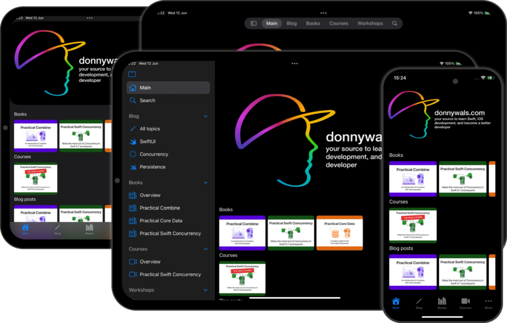
Notice how my tab bar has only a couple of items in it in the compact mode that’s used for a split-screen iPad or iPhone. On my full width iPad display I have a tab bar that contains several elements like “Blog” and “Books”. And when shown as a sidebar, these tab bar items become category headings instead.
Supporting all this is fairly straightforward but it comes with some gotchas that I’d like to outline in this post.
Setting up our TabView and Sections
While we do need to take into account several form factors and write some special code to handle smaller screens we’ll start by building out our large-screen TabView first.
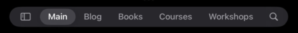
Within a TabView we can define both Tab and TabSection items. A Tab is shown as a tab in the tab view and the sidebar too. In the screenshot above I’ve added Main and Search as Tab in my TabView. You can see that they’re not grouped under any header.
Then there’s Blog, Books, Courses, and more. These are sections that all contain their own list of tabs.
Let’s go right ahead and look at the code that I use to build my hierarchy of tabs and sections. I’ll only include a single TabSection since the code would be pretty long and repetitive otherwise.
var body: some View {
    TabView {
        Tab("Main", systemImage: "house") {
            OverviewView()
        }

        TabSection("Blog") {
            Tab("All topics", systemImage: "pencil") {
                Text("This is the blog page")
            }

            Tab("SwiftUI", systemImage: "swift") {
                Text("SwiftUI topic")
            }

            Tab("Concurrency", systemImage: "timelapse") {
                Text("Concurrency topic")
            }

            Tab("Persistence", systemImage: "swiftdata") {
                Text("Persistence topic")
            }
        }

        // .. more TabSections

        Tab(role: .search) {
            Text("Search the site")
        }
    }
}
If I’d run this code as-is, my TabView would work but user’s won’t be able to toggle it into a sidebar. We’ll fix that in a moment. Let’s look at my hierarchy first.
My top-level Tab objects will always be shown on my tab bar. The Tab(role: .search) that I have here is a special case; that tab will always be shown on the trailing side of my tab bar with a search icon.
My TabSection is an interesting case. In tab bar view, the section’s name will be used as the name for my tab bar item. The view that’s shown to the user when they select this tab bar item is the detail view for the first Tab in the section. So in this case, that’s “All topics”. This is great because “All topics” is an overview page for the section.
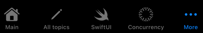
When running on a small screen however, every Tab is added to the tab bar regardless of their sections. This means that on iPhone, the tab bar is cluttered with all kinds of tab bar items we don’t want.
Here’s what we get when we run on iPhone. Notice that we don’t see the same tab bar items. Instead, every Tab we’ve defined at any level is being listed.
We’ll fix this after we enable sidebar toggling.
Enabling sidebar toggling
To allow users to switch our tab bar into a sidebar, we need to apply the tabViewStyle view modifier to the TabView as follows:
var body: some View {
    TabView {
      // tabs and sections...
    }
    .tabViewStyle(.sidebarAdaptable)
}
By setting the tabViewStyle to sidebarAdaptable, users can now toggle between our tab bar and a sidebar easily.
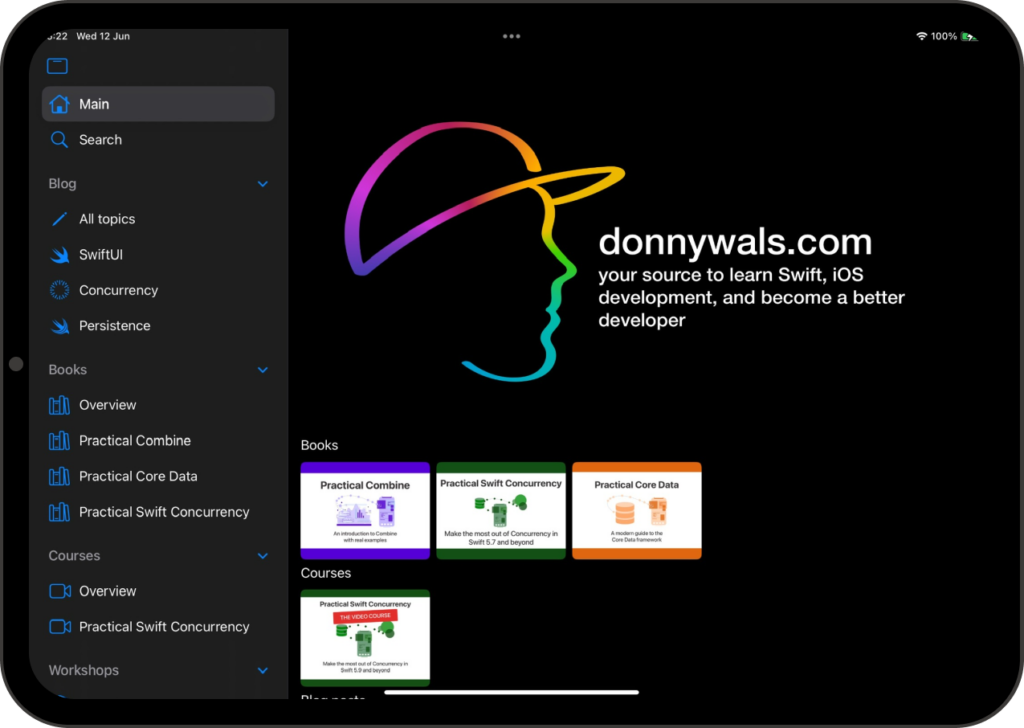
In sidebar mode, all of our root Tab items are listed first. After that, sections are listed with the section name as headers, and in each section we see the Tab views that we’ve added.
Switching between a sidebar and tab bar looks pretty good now and it works well.
But for smaller size classes (like phones and split-view iPad) we’ll want to do something else.
Let’s see how we can adapt our TabView to smaller screens.
Adapting the TabView to smaller screens
In SwiftUI, we can gain access to the current size class for our view through the environment. Since our TabView will become a traditional tab bar at the bottom of the screen on compact size classes and be in the new style on regular we can actually change the contents of our TabView based on the size class so that all extra items we had before will be gone if the size class is compact. Here’s what that looks like:
@Environment(\.horizontalSizeClass)
var horizontalSize

var body: some View {
    TabView {
        Tab("Main", systemImage: "house") {
            OverviewView()
        }

        if horizontalSize == .regular {
            TabSection("Blog") {
                Tab("All topics", systemImage: "pencil") {
                    Text("This is the blog page")
                }

                Tab("SwiftUI", systemImage: "swift") {
                    Text("SwiftUI topic")
                }

                Tab("Concurrency", systemImage: "timelapse") {
                    Text("Concurrency topic")
                }

                Tab("Persistence", systemImage: "swiftdata") {
                    Text("Persistence topic")
                }
            }
        } else {
            Tab("Blog", systemImage: "pencil") {
                Text("This is the blog page")
            }
        }

        // repeat for other sections...
    }
}
The code is relatively simple and it’s very effective. We’ll just have different tab items depending on the size class.
If you want to make sure that tab selection is maintained, you can actually reuse the same tag for tabs that represent the same screen in your app.
And that’s it! With this setup you’re ready to support iPhone and iPad while using the new tab bar and sidebar hybrid view.