Using compositional collection view layouts in iOS 13
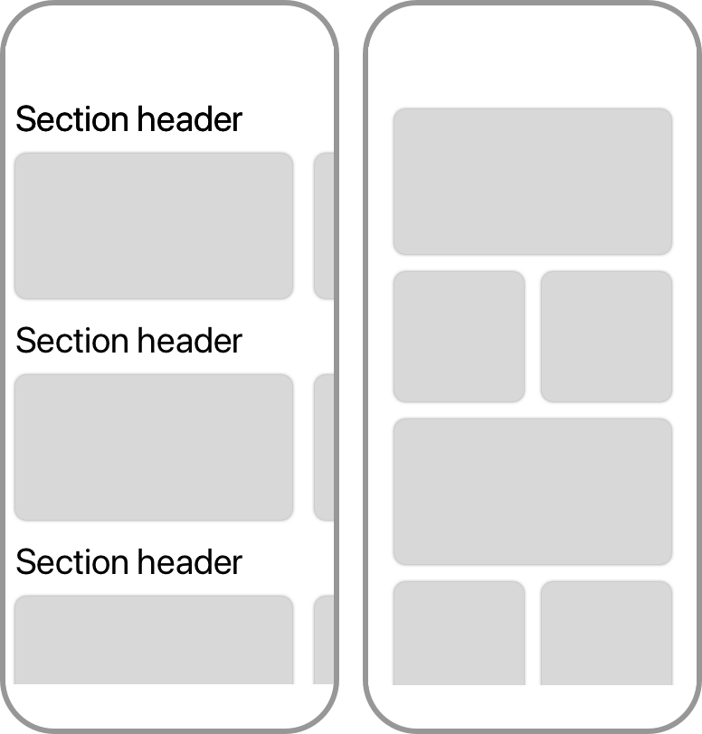
Published on: December 22, 2019Ever since iOS 6, developers have been able to use collection views and to build interesting custom layouts by subclassing the UICollectionViewLayout or UICollectionViewFlowLayout classes. I even wrote an article about building custom collection view layouts a while ago. Today, I would like to introduce you to a new way of defining collection view layouts called compositional layouts. We're going to build the two layouts shown in the following image:
I will first show you how to build a simple grid layout, and from there we'll continue working our way towards the end result.
Building a grid layout
A very common use of collection views is to display a grid layout. It's so common that Apple has included a grid layout called UICollectionViewFlowLayout with iOS since they introduced UICollectionView in iOS 6. Since it's such a familiar and relatively simple layout, I want to explore the basics of UICollectionViewCompositionalLayout with you by using it to build a grid. I'm going to assume that you have already got a collection view setup, possibly with a diffable data source. If you want to follow along with the code samples in this post, I would recommend that you always put your compositional layout code in a method, as I will soon demonstrate. You can then assign the layout to your collection view by writing the following in your viewDidLoad() method:
collectionView.collectionViewLayout = createCompositionalLayout()
Before I explain the anatomy of a compositional layout in detail, let's dive right in with an example:
func createCompositionalLayout() -> UICollectionViewCompositionalLayout {
  let itemSize = NSCollectionLayoutSize(widthDimension: .fractionalWidth(0.5),
                                       heightDimension: .fractionalHeight(1.0))
  let item = NSCollectionLayoutItem(layoutSize: itemSize)

  let groupSize = NSCollectionLayoutSize(widthDimension: .fractionalWidth(1.0),
                                        heightDimension: .fractionalWidth(0.5))
  let group = NSCollectionLayoutGroup.horizontal(layoutSize: groupSize, subitems: [item])

  let section = NSCollectionLayoutSection(group: group)

  let layout = UICollectionViewCompositionalLayout(section: section)
  return layout
}
If you examine the preceding code upward from the return statement, you will notice that the UICollectionViewCompositionalLayout initializer takes an instance of NSCollectionLayoutSection. In other words, a layout is built using sections. These sections are built using NSCollectionLayoutGroup instances. A single section can contain multiple groups, and as we'll see in the final section of this article, a section can also contain several different groups. Groups are considered to be the biggest workhorse of a compositional layout. You will typically do most configuration work on groups.
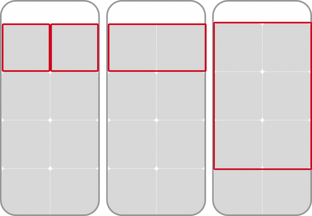
Notice that the example code uses NSCollectionLayoutGroup.horizontal to create the layout group. By making the layout group horizontal, all items that are added to the group will be positioned horizontally. This means that the group will position items on the horizontal axis until it has filled up its width, and then it starts positioning items on the next "line" until that contains as many items as can be fit in the group's width and so forth. We also pass the group one or more item configurations. In addition to items, a layout group also receives a size. In the example code, we use a fractional size. You might notice that I've used fractionalWidth for both the heightDimension and the widthDimension. The reason for this is that I want the grid to contain square items. To achieve this, I defined a group that takes the full width and is as tall as half of the screen width. If you now look at the declaration of the NSCollectionLayoutItem that is passed to the layout group, you'll see that an item has a fractional height of 1, and a fractional width of 0.5.
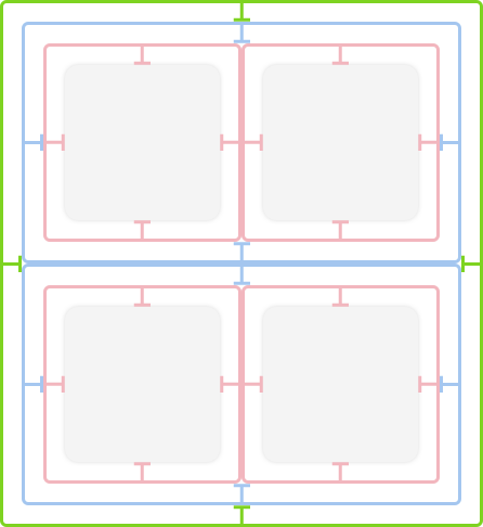
In other words, the layout group defined in the code above will fill the full width of its container and its height will be half the width of its container. The items inside of the group will all take up half the width of the container, and its full height, which makes the cells in the grid squares. The following image shows items, groups, and sections in an example grid layout.
In addition to a fractional width and height, you can also assign an absolute size using .absolute(240) which would make an item exactly 240 points wide or tall, or you can use .estimated(240) to let the system decide the optimal height for an item based on its contents.
If you would assign the layout that's generated by the createCompositionalLayout() method I just showed you to a collection view's collectionViewLayout property, you would get a very similar looking grid as a result. The items are a bit cramped though, so let's explore some of the spacing options we have.
Adjusting the spacing between items, groups, and sections
There are two possible ways to give your collection view cells some room to breathe:
- Assign edge insets on the items, groups or sections.
- Assign a spacing between individual items and groups.
When you assign edge inserts to an item, its size doesn't change. Examine the following image:
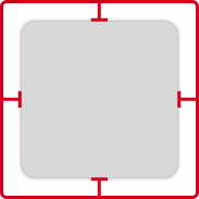
The red box around the gray square is the item's bounding box. It takes up the space that's defined by the item's NSCollectionLayoutSize. The insets are applied inward from that bounding box, and the cell is eventually rendered in the remaining space; the gray area in the above image. You can assign edge insets on an item using the following code:
item.contentInsets = NSDirectionalEdgeInsets(top: 8, leading: 8, bottom: 8, trailing: 8)
Try adding this line of code to the grid layout you've defined earlier and notice how it gives a nice spacing between cells.
It's also possible to apply insets to groups. The insets that you apply to groups follow the exact same rules as insets that are applied to items. The following image illustrates this nicely:
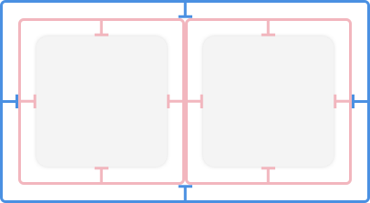
The gray squares are the rendered cells, the red lines are the bounding boxes for the items, and the blue lines indicate the bounding box for the layout group. And like items, this blue bounding box will have the size that you specify for the group itself, and the insets are applied inwards.
Lastly, you can apply insets to sections. Sections follow the same rules as groups and items, and their insets stack on top of the insets defined on items and groups:
The only difference is that sections always take up the full width of the viewport, and their height is always determined dynamically.
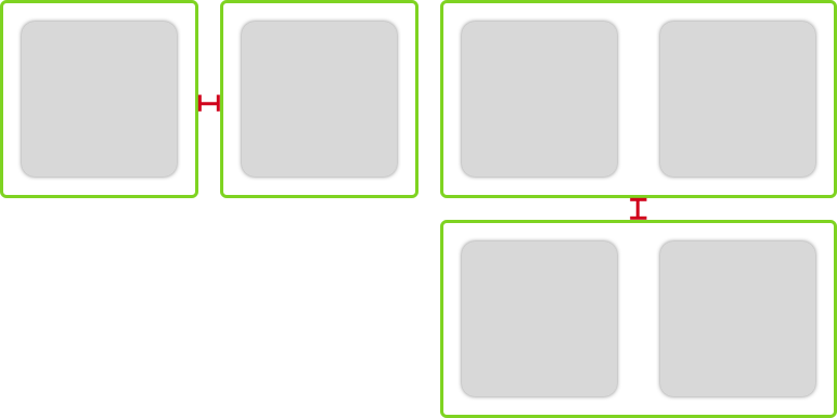
In addition to insets, you can specify how spacing should be applied between items and groups. Spacing is always applied to the bounding box of one element to the next as shown in the following screenshot by the red spacing indicator. Items are shown on the left, groups are shown on the right.
You can apply item and group spacing using the following code:
// item spacing
group.interItemSpacing = .fixed(15)

// group spacing
section.interGroupSpacing = 15
Note that we define item spacing on the group that contains the items, and group spacing on the section that contains the groups. And also note that the item spacing is defined as .fixed(15) in this case. This means that groups will always position their items with 15 points between them. You can also use .flexible(<spacing>) to allow the group to determine the best spacing between items based on its size, and the size of the items that it's positioning. The group will use the value of its flexible spacing as the minimum spacing between items; your items might be positioned further apart from each other than you specified, but never closer to each other.
I highly recommend using the simple grid layout I shared at the start of this section to explore the inset- and spacing options I've described in this section. A grid layout is simple and predictable which makes it a perfect candidate for exploration of options.
Adding section headers to a layout
At the beginning of this article, I told you that I would show you how to build two different layouts. One of these two layouts contains section headers. So let's see how you can add section headers to your compositional collection view layout. If you're following along with the code I'm presenting in this article, you can use the following code snippet in the context of your grid layout, or any other compositional layout you might already have:
let headerSize = NSCollectionLayoutSize(widthDimension: .fractionalWidth(1.0), heightDimension: .estimated(44))
let headerElement = NSCollectionLayoutBoundarySupplementaryItem(layoutSize: headerSize, elementKind: "header", alignment: .top)
section.boundarySupplementaryItems = [headerElement]
The first line of the preceding snippet should look familiar to you. The size of a collection view header is defined in exactly the same way as the size for items and groups. The header is defined as an instance of NSCollectionLayoutBoundarySupplementaryItem. Headers and footers are both different types of supplementary views, so they are defined in the exact same way. Depending on the value you pass to the alignment argument in the NSCollectionLayoutBoundarySupplementaryItem initializer, the supplementary view will act as a header, footer or just a decorative view. Also, note that there is an elementKind argument. This argument is a string identifier, similar to a cell reuse identifier that you use in your collection view data source when it's asked to provide a supplementary view.
Note:
Since this post is not about setting up a collection view data source, I'm not going to explain section headers in depth. In short, you need to implement thecollectionView(_:viewForSupplementaryElementOfKind:at:)method from theUICollectionViewDataSourceprotocol. You also need to register aUICollectionViewCellsubclass on your collection view using the collection view'sregister(_:forSupplementaryViewOfKind:withReuseIdentifier:)method. This method is very similar to registering a collection view cell in code, except you also supply the element kind string identifier.
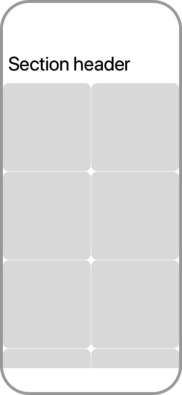
Amazingly, the code above is all you need to add section headers to your layout. The following image shows our progress in implementing the layout from the beginning of this article:
Building a layout that scrolls on both axis
Now that we have a basic grid with section headers to work off, let's implement the first collection view layout by changing just a couple of lines of code.
The first change to make is to reconfigure the groups in the grid layout a little bit. We'll make items inside of groups take up the entire space of the group, and we'll update the group so it takes up roughly 90% of the available with, and the group's height will be relative to the available width to make the group size (and item size) a size that is based on an aspect ratio:
let itemSize = NSCollectionLayoutSize(widthDimension: .fractionalWidth(1.0), heightDimension: .fractionalHeight(1.0))
let item = NSCollectionLayoutItem(layoutSize: itemSize)

let groupSize = NSCollectionLayoutSize(widthDimension: .fractionalWidth(0.9), heightDimension: .fractionalWidth(0.5))
let group = NSCollectionLayoutGroup.horizontal(layoutSize: groupSize, subitems: [item])
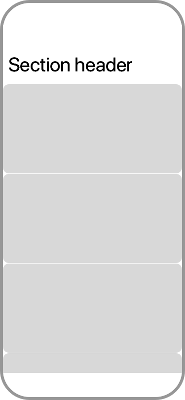
If you compare the code above to the grid code we had before, you'll notice that you only changed a couple of numbers. If you run your app with these changes, you should now have a layout with a section header where each cell takes up almost all width, and they are all stacked vertically as shown in the following image.
Let's make some more changes to make the items in a section appear next to each other so we can scroll through each section on the horizontal axis:
let section = NSCollectionLayoutSection(group: group)
section.orthogonalScrollingBehavior = .continuous
section.interGroupSpacing = 16
section.contentInsets = NSDirectionalEdgeInsets(top: 0, leading: 16, bottom: 0, trailing: 16)
The key line in the preceding snippet is section.orthogonalScrollingBehavior = .continuous. By assigning a value to the orthogonalScrollingBehavior property on a section, you flip everything on its head. The section will now place groups next to each other rather than on top of each other. And since every group in our layout contains a single item, we end up with a carousel that matches the design from the beginning of this post. Amazing, isn't it?
The orthogonal scrolling option that I chose in the preceding example is .continuous. This option will make each section scroll like a plain scroll view. The user drags their finger over the screen and the section scrolls. Other values for this option are .continuousGroupLeadingBoundary, .paging, .groupPaging, .groupPagingCentered and more. Some of these options implement a paging behavior, and others manipulate how a section responds when it's scrolled in more subtle ways. I can absolutely recommend that you take the examples from this article and play around with the different behaviors because they are tons of fun to mess around with.
That wraps up the first collection view layout I wanted to show you! We began with a simple grid, and by changing a couple of numbers, adding a header and setting a property on our sections, we now have a layout that can scroll horizontally and vertically. It's truly amazing how little code we needed, especially when compared with the code we would have to write without compositional layouts.
Creating an advanced grid
At the start of this article, I showed you a second grid layout. This layout is interesting because in order to build it we must use nested groups. When using a compositional layout, you can pas more than one item to an NSCollectionLayoutGroup's subitems array. When you do this, the group will use all items in order for the layout. So when you pass two items, the group will use the first item for the first cell it contains, the second item for the second cell and then the first item again for the third cell and so forth.
In our case, we want to create one regular item for the full-width cell, and then a nested group that contains two half-sized items for the two smaller cells that are positioned below the wide cell. The following code can be used to create the layout we're looking for:
func createCompositionalLayout() -> UICollectionViewCompositionalLayout {
  let inset: CGFloat = 8

  // Large item on top
  let topItemSize = NSCollectionLayoutSize(widthDimension: .fractionalWidth(1.0), heightDimension: .fractionalWidth(9/16))
  let topItem = NSCollectionLayoutItem(layoutSize: topItemSize)
  topItem.contentInsets = NSDirectionalEdgeInsets(top: inset, leading: inset, bottom: inset, trailing: inset)

  // Bottom item
  let bottomItemSize = NSCollectionLayoutSize(widthDimension: .fractionalWidth(0.5), heightDimension: .fractionalHeight(1.0))
  let bottomItem = NSCollectionLayoutItem(layoutSize: bottomItemSize)
  bottomItem.contentInsets = NSDirectionalEdgeInsets(top: inset, leading: inset, bottom: inset, trailing: inset)

  // Group for bottom item, it repeats the bottom item twice
  let bottomGroupSize = NSCollectionLayoutSize(widthDimension: .fractionalWidth(1), heightDimension: .fractionalWidth(0.5))
  let bottomGroup = NSCollectionLayoutGroup.horizontal(layoutSize: bottomGroupSize, subitem: bottomItem, count: 2)

  // Combine the top item and bottom group
  let fullGroupSize = NSCollectionLayoutSize(widthDimension: .fractionalWidth(1.0), heightDimension: .fractionalWidth(9/16 + 0.5))
  let nestedGroup = NSCollectionLayoutGroup.vertical(layoutSize: fullGroupSize, subitems: [topItem, bottomGroup])

  let section = NSCollectionLayoutSection(group: nestedGroup)

  let layout = UICollectionViewCompositionalLayout(section: section)

  return layout
}
I added some comments to the code. All of this should look familiar to you, it's mostly just a different way of composing the elements you have learned about in this article. This familiarity is exactly what makes compositional layouts so powerful. It doesn't matter whether you want to build something simple like a grid, or something more complex like we just did, you always use the exact same components composed in a different way. Cool, right?
In summary
Today's article introduced the new UICollectionViewCompositionalLayout class. You learned that this class allows you to specify complicated collection view layouts using four simple building blocks; items, groups, sections and the layout itself. With these blocks you can build layouts that would be a nightmare to implement using the good old UICollectionViewFlowLayout and the code to do this is simple and concise.
You saw how to build a collection view layout that positions its sections vertically, and the items within the section can be scrolled through horizontally. You learned that this is called orthogonal scrolling, and it can be enabled with just a single line of code. You also saw how you can nest groups to build a somewhat irregular looking layout that's very interesting visually.
If you have any questions about this article, or if you have built something really cool that with a compositional layout make sure to let me know. I love to hear from you.