Designing custom UI with Liquid Glass on iOS 26
Published on: July 1, 2025Updated on: July 10, 2025
Liquid Glass is iOS 26’s new design language. This means that a lot of apps will be adopting a new UI philosophy that might require some significant changes to how you’re designing your app’s UI.
If you’re not ready to adopt Liquid Glass just yet, Apple has provided you an escape hatch that should be usable until the next major iOS release.
I recently explored updating my workout app Maxine to work well with Liquid Glass tab bars which you can learn more about here.
In this post, I’d like to explore how we can build custom Liquid Glass components for our apps running on iOS 26 and its siblings. We’ll start off by exploring when Liquid Glass is appropriate and then move on to look at SwiftUI’s Liquid Glass related view modifiers.
By the end of this post, we’ll have built the UI that you can see in action below (video slowed down for dramatic effect):
If you prefer learning through video, you can take a look at this post on YouTube
When should you use Liquid Glass
The idea of Liquid Glass is that it acts as a layer on top of your app’s UI. In practice this will usually mean that your main app content isn’t built using the glass style. Doing so would result in some pretty bad looking UI as you can see in this video:
In this video, I applied a glass effect to all of my list rows. The result is a super weird interface that overuses Liquid Glass.
Instead, Liquid Glass should be applied to elements that sit on top of your UI. Examples include toolbars, tab bars, floating action buttons and similar components.
An example of this can be seen right here in Maxine:
The default tab bar is a Liquid Glass component that overlays my list. The floating plus button also has a glass effect applied to it even though you can barely see it due to the light background.
The point is that Liquid Glass elements should always be designed as sitting “on top” of something. They don’t stack, they’re not part of your main UI, they’re always on their own layer when you’re designing.
Now, I’m not a designer. So if you can come up with a great way to use Liquid Glass that places an element in your main content. I’m not going to tell you that you can’t or shouldn’t; you probably know much better than I do. That said, Apple’s philosophy for Liquid Glass is a layered design so for safety you should probably stick to that.
Applying a Liquid Glass effect to UI elements
Let’s build out a nice UI element that can really benefit from a Liquid Glass look and feel. It’s a UI element that existed in an app called Path which no longer exists, and the UI element hasn’t really been used much since. That said, I like the interaction and I think it’ll be fun to give it a glass overhaul.
Our Starting point
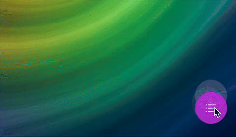
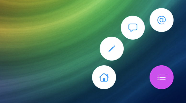
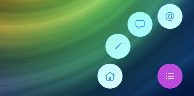
You can see an example of the button and its UI right here:
It takes quite some code to achieve this effect, and most of it isn’t relevant to Liquid Glass. That’s why you can take a look at the final code right here on GitHub. There’s a branch for the starting point as well as the end result (main) so you can play around a bit if you’d like.
The view itself looks like this:
struct ContentView: View {
    @State private var isExpanded = false
    var body: some View {
        ZStack(alignment: .bottomTrailing) {
            Color
                .clear
                .overlay(
                    Image("bg_img")
                        .resizable()
                        .scaledToFill()
                        .edgesIgnoringSafeArea(.all)
                )

            button(type: .home)
            button(type: .write)
            button(type: .chat)
            button(type: .email)

            Button {
                withAnimation {
                    isExpanded.toggle()
                }
            } label: {
                Label("Home", systemImage: "list.bullet")
                    .labelStyle(.iconOnly)
                    .frame(width: 50, height: 50)
                    .background(Circle().fill(.purple))
                    .foregroundColor(.white)
            }.padding(32)
        }
    }

    private func button(type: ButtonType) -> some View {
        return Button {} label: {
            Label(type.label, systemImage: type.systemImage)
                .labelStyle(.iconOnly)
                .frame(width: 50, height:50)
                .background(Circle().fill(.white))
        }
        .padding(32)
        .offset(type.offset(expanded: isExpanded)
        .animation(.spring(duration: type.duration, bounce: 0.2))
    }
}
This view on its own isn’t all that interesting, it contains a couple of buttons, and applying a liquid glass effect to our buttons shouldn’t be too hard.
Applying a glass effect
To make buttons look like Liquid Glass, you apply the glassEffect view modifier to them:
Button {
withAnimation {
isExpanded.toggle()
}
} label: {
Label("Home", systemImage: "list.bullet")
.labelStyle(.iconOnly)
.frame(width: 50, height: 50)
.background(Circle().fill(.purple))
.foregroundColor(.white)
}
.glassEffect()
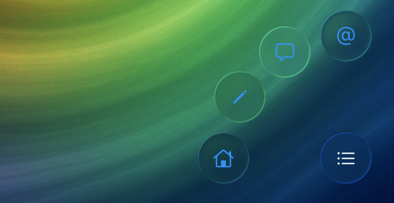
.padding(32)After applying the liquidGlass modifier to all buttons the app looks like this when you run it:
We’re not seeing a glass effect at all!
That’s because we also set a background on our buttons, so let’s go ahead and remove the background to see what our view looks like:
Button {
    withAnimation {
        isExpanded.toggle()
    }
} label: {
    Label("Home", systemImage: "list.bullet")
        .labelStyle(.iconOnly)
        .frame(width: 50, height: 50)
        .foregroundColor(.white)
}
.glassEffect()
.padding(32)
If we run the app now, our UI looks like this:
Our icons are a bit hard to read and I’m honestly not exactly sure whether this is a beta bug or whether it’s supposed to be this way.
Note that Button also comes with a .glass button style that you can use. This effect is slightly different from what I’ve used here but I find that the button style doesn’t always allow for the kinds of customizations that I like.
You can apply the glass button style as follows:
Button {
    withAnimation {
        isExpanded.toggle()
    }
} label: {
    Label("Home", systemImage: "list.bullet")
        .labelStyle(.iconOnly)
        .frame(width: 50, height: 50)
        .foregroundColor(.white)
}
.buttonStyle(.glass)
.padding(32)
That said, there are two things I’d like to do at this point:
- Apply a background tint to the buttons
- Make the buttons appear interactive
Let's start with the background color.
Applying a background color to our glass effect
To style our buttons with a background color, we need to tint our glass. Here’s how we can do that:
Button {
    withAnimation {
        isExpanded.toggle()
    }
} label: {
    Label("Home", systemImage: "list.bullet")
        .labelStyle(.iconOnly)
        .frame(width: 50, height: 50)
        .foregroundColor(.white)
}
.glassEffect(.regular.tint(.purple))
.padding(32)
This already looks a lot better:
Notice that the buttons still have a circular shape even though we're not explicitly drawing a circle background. That’s the default style for components that you apply a glassEffect to. You’ll always get a shape that has rounded corners that fit nicely with the rest of your app’s UI and the context where the effect is applied.
I do feel like my buttons are a bit too opaque, so let’s apply a bit of opacity to our tint color to get more of a see-through effect:
Button {
    withAnimation {
        isExpanded.toggle()
    }
} label: {
    Label("Home", systemImage: "list.bullet")
        .labelStyle(.iconOnly)
        .frame(width: 50, height: 50)
        .foregroundColor(.white)
}
.glassEffect(.regular.tint(.purple.opacity(0.8))
.padding(32)
This is what our view looks like now:
When I tap the buttons now, not a lot happens as shown in the video above. We can do better by making our buttons respond to user interaction.
Making an interactive glass effect
To make our glass buttons respond to user input by growing a bit and applying a sort of shimmer effect, we apply the interactive modifier to the glass effect:
Button {
    withAnimation {
        isExpanded.toggle()
    }
} label: {
    Label("Home", systemImage: "list.bullet")
        .labelStyle(.iconOnly)
        .frame(width: 50, height: 50)
        .foregroundColor(.white)
}
.glassEffect(.regular.tint(.purple.opacity(0.8).interactive())
.padding(32)
This is what our interactions look like now:
Our UI is coming together. With the glassEffect view modifier, the interactive modifier and a tint we managed to build a pretty compelling effect.
However, our UI isn’t quite liquid. You’re looking at distinct buttons performing an effect.
We can group our elements together to make it appear as though they’re all coming from the same drop of glass.
This sounds a bit weird so let’s just jump into an example right away.
Grouping Liquid Glass elements together
The first thing we should do now that we have a group of elements that are all using a Liquid Glass effect is group them together in a container. This is a recommendation from Apple that helps make sure the system can render our effects efficiently. It also makes it so that Liquid Glass elements that are close together will start to blend into each other. This makes it look like they're all merging and seperating as they move around the screen.
GlassEffectContainer {
button(type: .home)
button(type: .write)
button(type: .chat)
button(type: .email)
Button {
withAnimation {
isExpanded.toggle()
}
} label: {
Label("Home", systemImage: "list.bullet")
.labelStyle(.iconOnly)
.frame(width: 50, height: 50)
.foregroundColor(.white)
}
.glassEffect(.regular.tint(.purple.opacity(0.8)).interactive())
.padding(32)
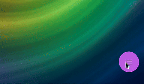
}By placing our Liquid Glass UI elements in the same container, the elements will blend together when they’re close to each other in the UI. For example, when we place all buttons in an HStack with no spacing, they end up looking like this:
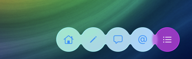
Because all the elements are in the same GlassEffectContainer, we can now run our animation and have the buttons animate in a fluid manner:
I’ve slowed everything down a bit so you can enjoy the effect and see that the components all originate from a single button, making them look like a liquid.
The math to achieve all this is part of the ButtonType enum in the GitHub repository that you can check out if you want to see exactly how the end result was achieved.
In Summary
Liquid glass might not be your thing and that’s perfectly fine. That said, it allows us to experiment with UI in fun ways that might surprise you.
In this post, you learned about the glassEffect modifier as well as the glassEffectID view modifier to build a fun menu component that can show and hide itself using a fun, fluid animation.
If you want to see the end result or use this code, feel free to pull it from GitHub and modify it to suit your needs.