Exploring tab bars on iOS 26 with Liquid Glass
Published on: June 19, 2025Updated on: July 7, 2025
When your app has a tab bar and you recompile it using Xcode 26, you will automatically see that your tab bar has a new look and feel based on Liquid Glass. In this blog post, we’ll explore the new tab bar, and which new capabilities we’ve gained with the Liquid Glass redesign.
By the end of this post you’ll have a much better sense of how Liquid Glass changes your app’s tab bar, and how you can configure the tab bar to really lean into iOS 26’s Liquid Glass design philosophy.
Tab Bar basics in iOS 26
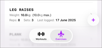
If you’ve adopted iOS 18’s tab bar updates, you’re already in a really good spot for adopting the new features that we get with Liquid Glass. If you haven’t, here’s what a very simple tab bar looks like using TabView and Tab:
TabView {
Tab("Workouts", systemImage: "dumbbell.fill") {
WorkoutsView()
}
Tab("Exercises", systemImage: "figure.strengthtraining.traditional") {
ExercisesView()
}
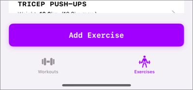
}When you compile your app with Xcode 26, and you run it on a device with iOS 18 installed, your tab bar would look a bit like this:
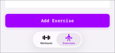
When running the exact some code on iOS 26, you’ll find that the tab bar gets a new Liquid Glass based design:
Liquid glass encourages a more layer approach to designing your app, so having this approach where there’s a large button above the tab bar and obscuring content isn’t very iOS 26-like.
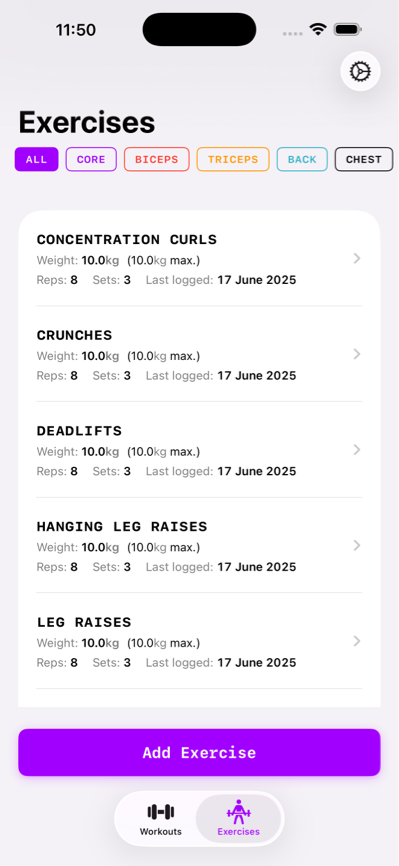
Here’s what the full screen that this tab bar is on looks like:
To make this app feel more at home on iOS 26, I think we should expand the list’s contents so that they end up underneath the tab bar using a bit of a blurry overlay. Similar to what Apple does for their own apps:
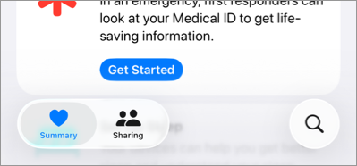
Notice that this app has a left-aligned tab bar and that there’s a search button at the bottom as well. Before we talk a bit about how to achieve that layout, I’d like to explore the setup where they have content that expands underneath the tab bar first. After that we’ll look at more advanced tab bar features like having a search button and more.
Understanding the tab bar’s blur effect
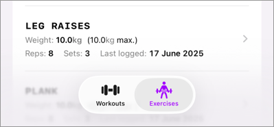
If you’ve spent time with the tab bar already, you’ll know that the blur effect that we see in the health app is actually the default effect for a tab bar that sits on top of a scrollable container.
The app we’re looking at in this post has a view layout that looks a bit like this:
VStack {
  ScrollView(.horizontal) { /* filter options */ }
  List { /* The exercises */ }
  Button { /* The purple button + action */
}
The resulting effect is that the tab doesn’t overlay a scrolling container, and we end up with a solid colored background.
If we remove the button for now, we actually get the blurred background behavior that we want:
The next objective now is to add that “Add Exercise” button again in a way that blends nicely with Liquid Glass, so let’s explore some other cool tab view behaviors on iOS 26, and how we can enable those.
Minimizing a Liquid Glass tab view
Let’s start with a cool effect that we can apply to a tab bar to make it less prominent while the user scrolls.
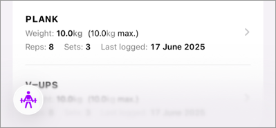
While this effect doesn’t bring our “Add Exercise” button back, it does opt-in to a feature from iOS 26 that I like a lot. We can have our tab bar minimize when the user scrolls up or down by applying a new view modifier to our TabView:
TabView {
  /* ... */
}.tabBarMinimizeBehavior(.onScrollDown)
When this view modifier is applied to your tab view, it will automatically minimize itself when the content that’s overlayed by the tab bar gets scrolled. So in our case, the tab bar minimizes when the list of exercises gets scrolled.
Note that the tab bar doesn’t minimize if we’d apply this view modifier with the old design. That’s because the tab bar didn’t overlay any scrolling content. This makes it even more clear that the old design really doesn’t fit well in a liquid glass world.
Let’s see how we can add our button on top of the Liquid Glass TabView in a way that fits nicely with the new design.
Adding a view above your tab bar on iOS 26
On iOS 26 we’ve gained the ability to add an accessory view to our tab bars. This view will be placed above your tab bar on iOS and when your tab bar minimizes the accessory view is placed next to the minimized tab bar button:
Note that the button seems a little cut off in the minimized example. This seems to be a but in the beta as far as I can tell right now; if later in the beta cycle it turns out that I’m doing something wrong here, I will update the article as needed.
To place an accessory view on a tab bar, you apply the tabViewBottomAccessory view modifier to your TabView:
TabView {
  /* ... */
}
.tabBarMinimizeBehavior(.onScrollDown)
.tabViewBottomAccessory {
  Button("Add exercise") {
    // Action to add an exercise
  }.purpleButton()
}
Note that the accessory will be visible for every tab in your app so our usage here might not be the best approach; but it works. It’s possible to check the active tab inside of your view modifier to return different buttons or views depending on the active tab:
.tabViewBottomAccessory {
  if activeTab == .workouts {
    Button("Start workout") {
      // Action to add an exercise
    }.purpleButton()
  } else {
    Button("Add exercise") {
      // Action to add an exercise
    }.purpleButton()
  }
}
Again, this works but I’m not sure this is the intended use case for a bottom accessory. Apple’s own usage seems pretty limited to views that are relevant for every view in the app. Like the music app where they have player controls as the tab view’s accessory.
So, while this approach let us add the “Add exercise” button again; it seems like this isn’t the way to go.
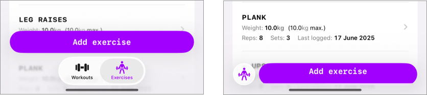
Adding a floating button to our view
In the health app example from before, there was a search button in the bottom right side of the screen. We can add a button of our own to that location by using a TabItem in our TabView that has a .search role:
Tab("Add", systemImage: "plus", value: Tabs.exercises, role: .search) {
  /* Your view */
}
While this adds a bottom to the bottom right of our view, it’s far from a solution to replacing our view-specific “Add exercise” button. A Tab that has a search role is separated from your other tabs but you’re expected to present a full screen view from this tab. So a search tab really only makes sense when your current tab bar contains a search page.
That said, I do think that a floating button is what we need in this Liquid Glass world so let’s add one to our exercises view.
It won’t use the TabView APIs but I do think it’s important to cover the solution that works well in my opinion.
Given that Liquid Glass enforces a more layered design, this pattern of having a large button at the bottom of our list just doesn’t work as well as it used to.
Instead, we can leverage a ZStack and add a button on top of it so we can have our scrolling content look the way that we like while also having an “Add Exercise” button:
ZStack(alignment: .bottomTrailing) {
  // view contents

  Button(action: {
    // ...
  }) {
    Label("Add Exercise", systemImage: "plus")
      .bold()
      .labelStyle(.iconOnly)
      .padding()
  }
  .glassEffect(.regular.interactive())
  .padding([.bottom, .trailing], 12)
}
The key to making our floating button look at home is applying the glassEffect view modifier. I won’t cover that modifier in depth but you can probably guess what it does; it makes our button have that Liquid Glass design that we’re looking for:
I’m not 100% sold on this approach because I felt like there was something nice about having that large purple button in my old design. But, this is a new design era. And this feels like it’s something that would fit nicely in the iOS 26 design language.
In Summary
Knowing which options you have for customizing iOS 26’s TabView will greatly help with adopting Liquid Glass. Knowing how you can minimize your tab bar, or when to assign an accessory view can really help you build better experiences for your users. Adding a search tab with the search role will help SwiftUI position your search feature properly and consistently across platforms.
While Liquid Glass is a huge change in terms of design language, I like these new TabView APIs a lot and I’m excited to spend more time with them.